shahid lecture-2- mkag1273
TRANSCRIPT

Statistical HydrologyMAL1303/MKAG1273
Graphical Data Analysis
Dr. Shamsuddin ShahidAssociate Professor
Department of Hydraulics and HydrologyFaculty of Civil Engineering
Room No.: M46-332; Phone: 07-5531624; Mobile: 0182051586
Email: [email protected]
11/23/2015 Shamsuddin Shahid, FKA, UTM
You created this PDF from an application that is not licensed to print to novaPDF printer (http://www.novapdf.com)
11/23/2015 Shamsuddin Shahid, FKA, UTM
You created this PDF from an application that is not licensed to print to novaPDF printer (http://www.novapdf.com)
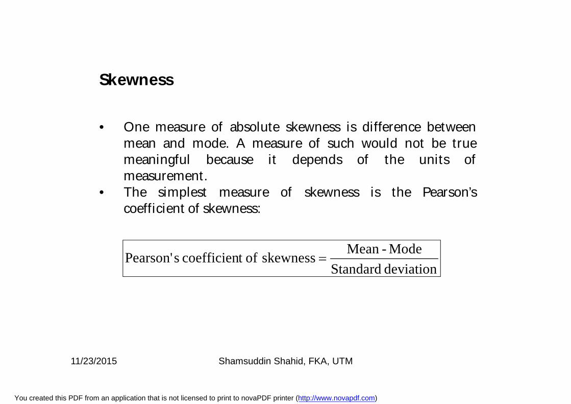
• One measure of absolute skewness is difference betweenmean and mode. A measure of such would not be truemeaningful because it depends of the units ofmeasurement.
• The simplest measure of skewness is the Pearson’scoefficient of skewness:
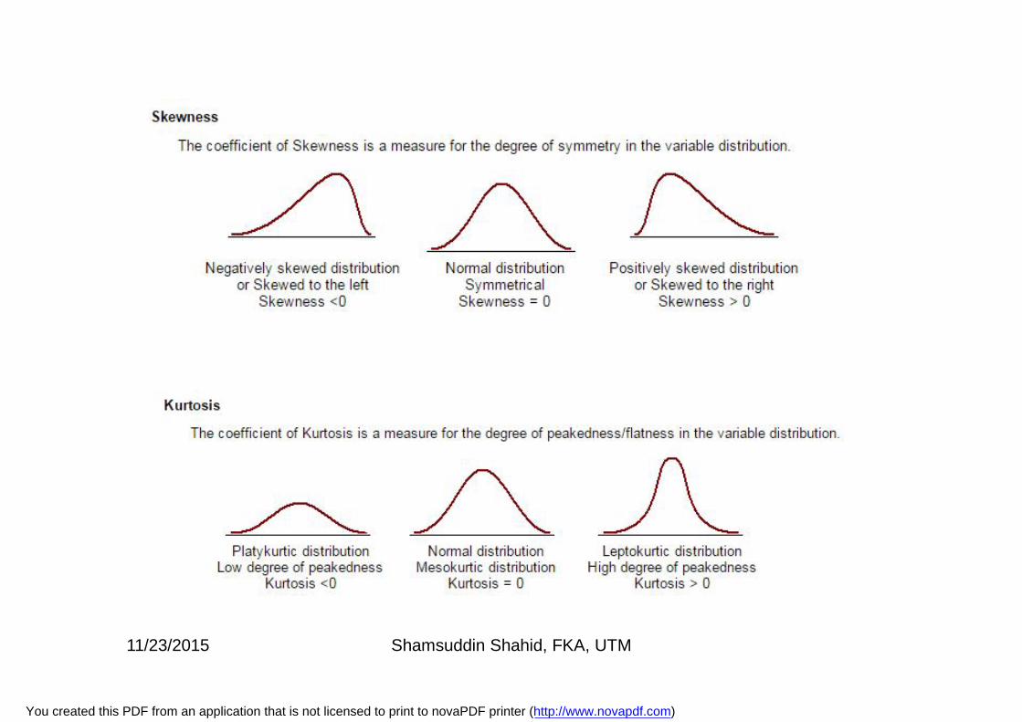
Skewness
deviation StandardMode-Meanskewness oft coefficien sPearson'
11/23/2015 Shamsuddin Shahid, FKA, UTM
You created this PDF from an application that is not licensed to print to novaPDF printer (http://www.novapdf.com)
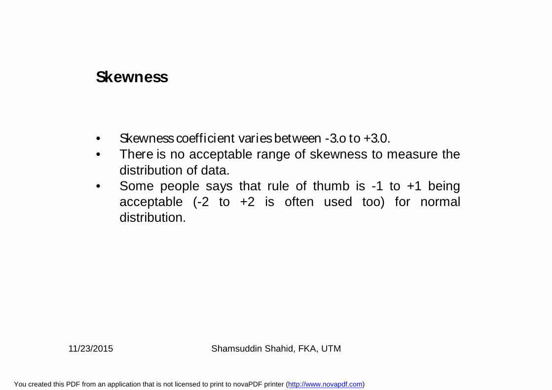
• Skewness coefficient varies between -3.o to +3.0.• There is no acceptable range of skewness to measure the
distribution of data.• Some people says that rule of thumb is -1 to +1 being
acceptable (-2 to +2 is often used too) for normaldistribution.
Skewness
11/23/2015 Shamsuddin Shahid, FKA, UTM
You created this PDF from an application that is not licensed to print to novaPDF printer (http://www.novapdf.com)
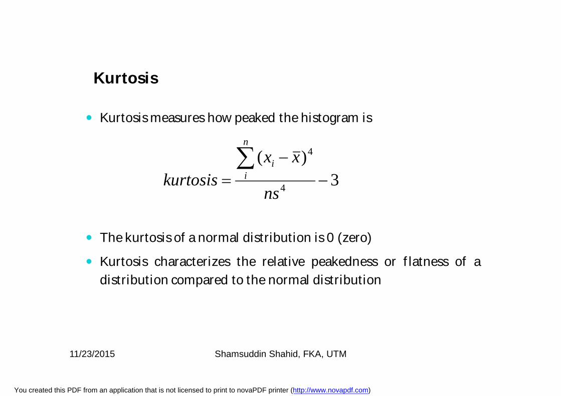
Kurtosis measures how peaked the histogram is
The kurtosis of a normal distribution is 0 (zero)
Kurtosis characterizes the relative peakedness or flatness of adistribution compared to the normal distribution
3)(
4
4
ns
xxkurtosis
n
ii
Kurtosis
11/23/2015 Shamsuddin Shahid, FKA, UTM
You created this PDF from an application that is not licensed to print to novaPDF printer (http://www.novapdf.com)
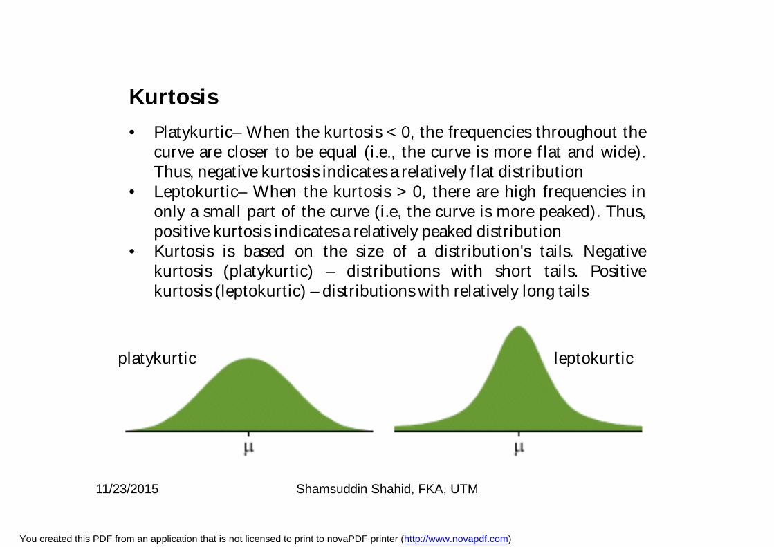
• Platykurtic– When the kurtosis < 0, the frequencies throughout thecurve are closer to be equal (i.e., the curve is more flat and wide).Thus, negative kurtosis indicates a relatively flat distribution
• Leptokurtic– When the kurtosis > 0, there are high frequencies inonly a small part of the curve (i.e, the curve is more peaked). Thus,positive kurtosis indicates a relatively peaked distribution
• Kurtosis is based on the size of a distribution's tails. Negativekurtosis (platykurtic) – distributions with short tails. Positivekurtosis (leptokurtic) – distributions with relatively long tails
leptokurticplatykurtic
Kurtosis
11/23/2015 Shamsuddin Shahid, FKA, UTM
You created this PDF from an application that is not licensed to print to novaPDF printer (http://www.novapdf.com)
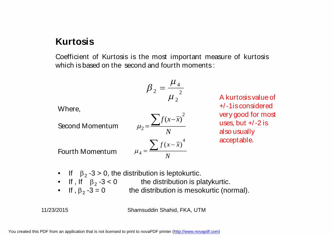
Coefficient of Kurtosis is the most important measure of kurtosiswhich is based on the second and fourth moments :
Kurtosis
22
42
N
xxf2
2)(
N
xxf4
4
)(
Where,
Second Momentum
Fourth Momentum
• If 2 -3 > 0, the distribution is leptokurtic.• If , If 2 -3 < 0 the distribution is platykurtic.• If , 2 -3 = 0 the distribution is mesokurtic (normal).
A kurtosis value of +/-1 is considered very good for most uses, but +/-2 is also usually acceptable.
11/23/2015 Shamsuddin Shahid, FKA, UTM
You created this PDF from an application that is not licensed to print to novaPDF printer (http://www.novapdf.com)
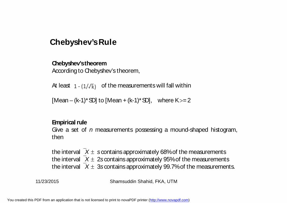
Chebyshev’s theoremAccording to Chebyshev’s theorem,
At least of the measurements will fall within
[Mean – (k-1)*SD] to [Mean + (k-1)*SD], where K = 2
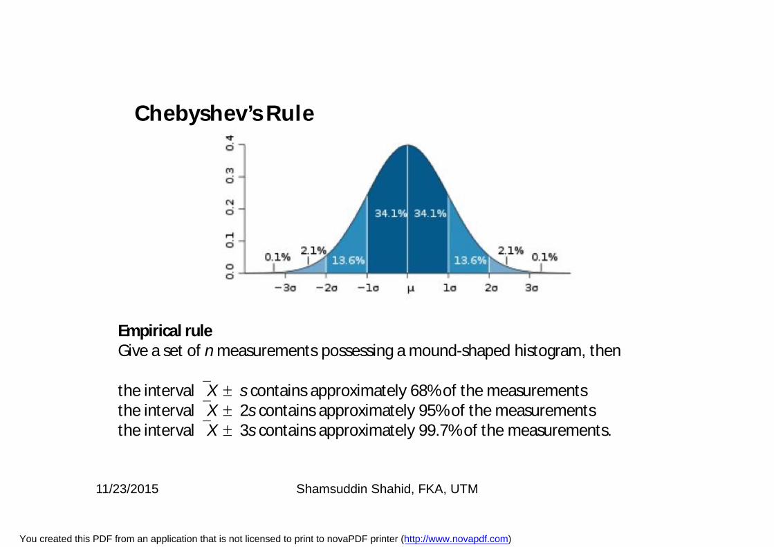
Empirical ruleGive a set of n measurements possessing a mound-shaped histogram,then
the interval X s contains approximately 68% of the measurementsthe interval X 2s contains approximately 95% of the measurementsthe interval X 3s contains approximately 99.7% of the measurements.
Chebyshev’s Rule
11/23/2015 Shamsuddin Shahid, FKA, UTM
You created this PDF from an application that is not licensed to print to novaPDF printer (http://www.novapdf.com)
Empirical ruleGive a set of n measurements possessing a mound-shaped histogram, then
the interval X s contains approximately 68% of the measurementsthe interval X 2s contains approximately 95% of the measurementsthe interval X 3s contains approximately 99.7% of the measurements.
Chebyshev’s Rule
11/23/2015 Shamsuddin Shahid, FKA, UTM
You created this PDF from an application that is not licensed to print to novaPDF printer (http://www.novapdf.com)
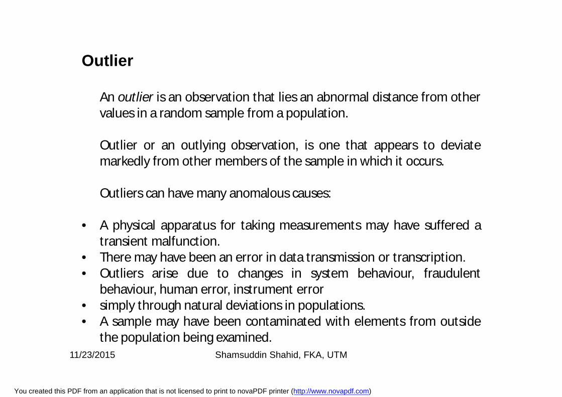
Outlier
An outlier is an observation that lies an abnormal distance from othervalues in a random sample from a population.
Outlier or an outlying observation, is one that appears to deviatemarkedly from other members of the sample in which it occurs.
Outliers can have many anomalous causes:
• A physical apparatus for taking measurements may have suffered atransient malfunction.
• There may have been an error in data transmission or transcription.• Outliers arise due to changes in system behaviour, fraudulent
behaviour, human error, instrument error• simply through natural deviations in populations.• A sample may have been contaminated with elements from outside
the population being examined.11/23/2015 Shamsuddin Shahid, FKA, UTM
You created this PDF from an application that is not licensed to print to novaPDF printer (http://www.novapdf.com)
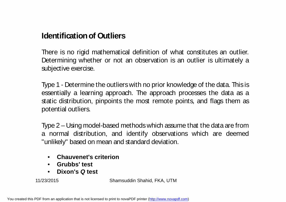
Identification of Outliers
There is no rigid mathematical definition of what constitutes an outlier.Determining whether or not an observation is an outlier is ultimately asubjective exercise.
Type 1 - Determine the outliers with no prior knowledge of the data. This isessentially a learning approach. The approach processes the data as astatic distribution, pinpoints the most remote points, and flags them aspotential outliers.
Type 2 – Using model-based methods which assume that the data are froma normal distribution, and identify observations which are deemed"unlikely" based on mean and standard deviation.
• Chauvenet's criterion• Grubbs' test• Dixon's Q test
11/23/2015 Shamsuddin Shahid, FKA, UTM
You created this PDF from an application that is not licensed to print to novaPDF printer (http://www.novapdf.com)
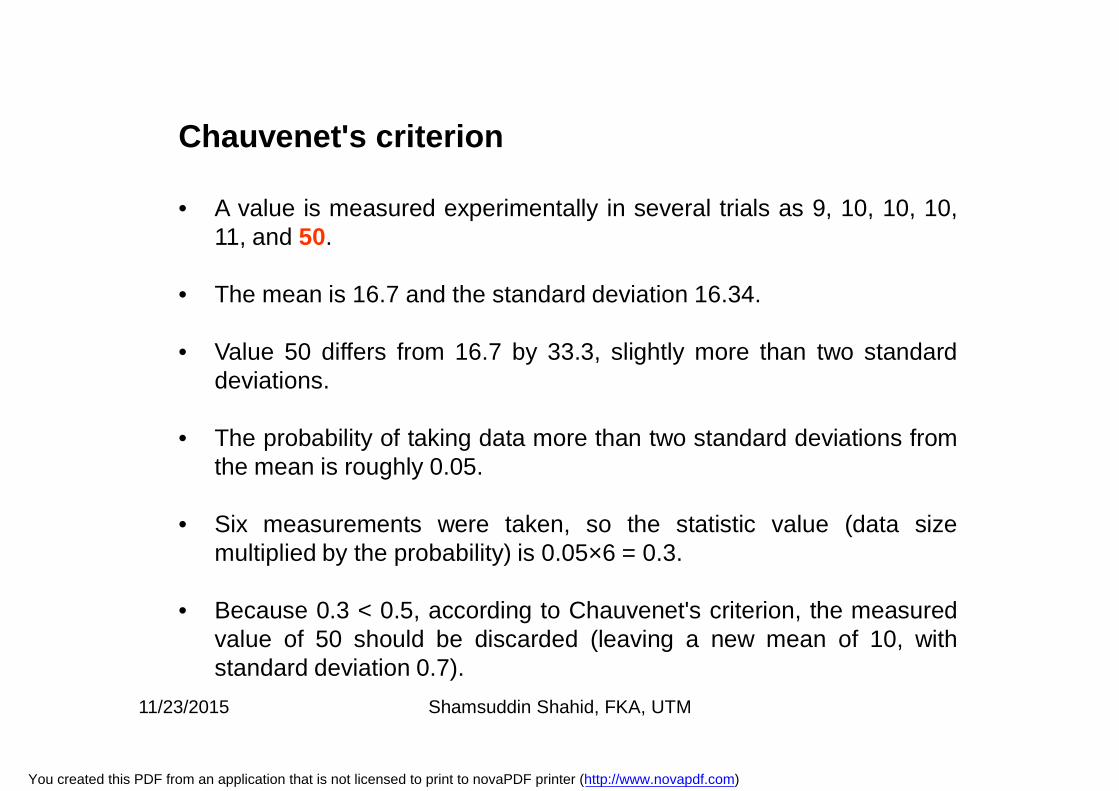
Chauvenet's criterion
• A value is measured experimentally in several trials as 9, 10, 10, 10,11, and 50.
• The mean is 16.7 and the standard deviation 16.34.
• Value 50 differs from 16.7 by 33.3, slightly more than two standarddeviations.
• The probability of taking data more than two standard deviations fromthe mean is roughly 0.05.
• Six measurements were taken, so the statistic value (data sizemultiplied by the probability) is 0.05×6 = 0.3.
• Because 0.3 < 0.5, according to Chauvenet's criterion, the measuredvalue of 50 should be discarded (leaving a new mean of 10, withstandard deviation 0.7).
11/23/2015 Shamsuddin Shahid, FKA, UTM
You created this PDF from an application that is not licensed to print to novaPDF printer (http://www.novapdf.com)
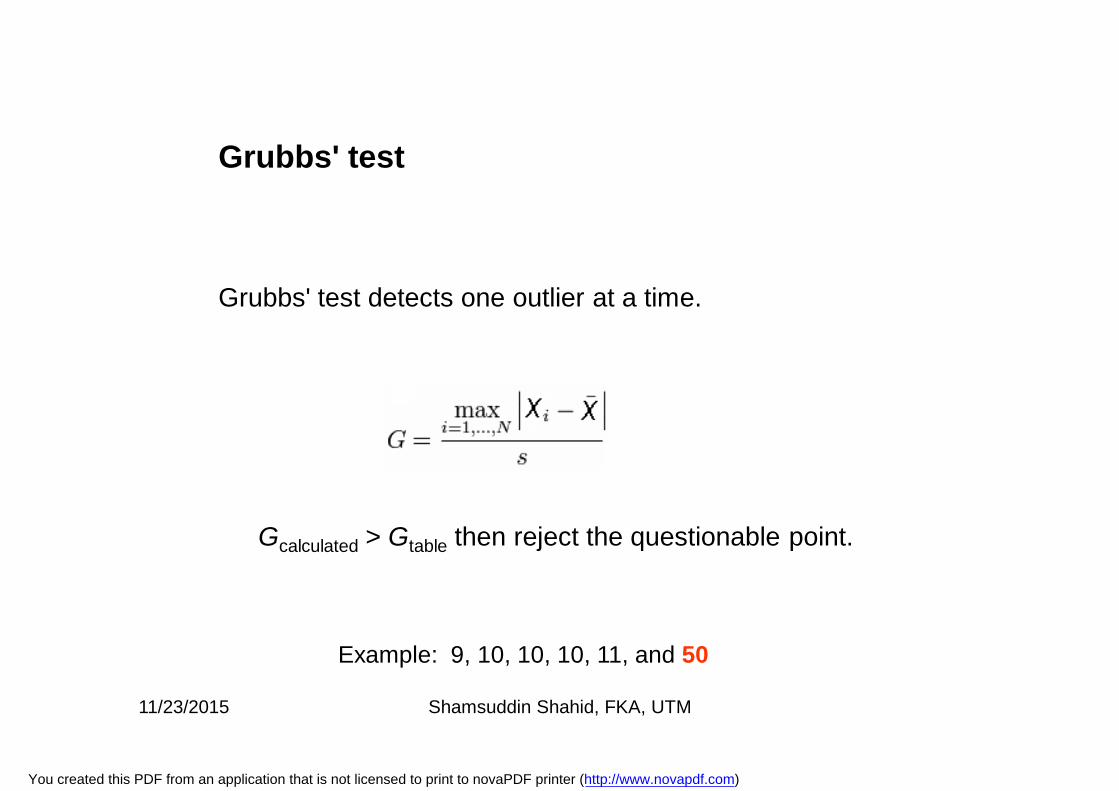
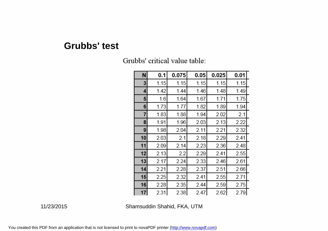
Grubbs' test detects one outlier at a time.
Gcalculated > Gtable then reject the questionable point.
Grubbs' test
Example: 9, 10, 10, 10, 11, and 50
11/23/2015 Shamsuddin Shahid, FKA, UTM
You created this PDF from an application that is not licensed to print to novaPDF printer (http://www.novapdf.com)
Grubbs' test
11/23/2015 Shamsuddin Shahid, FKA, UTM
You created this PDF from an application that is not licensed to print to novaPDF printer (http://www.novapdf.com)
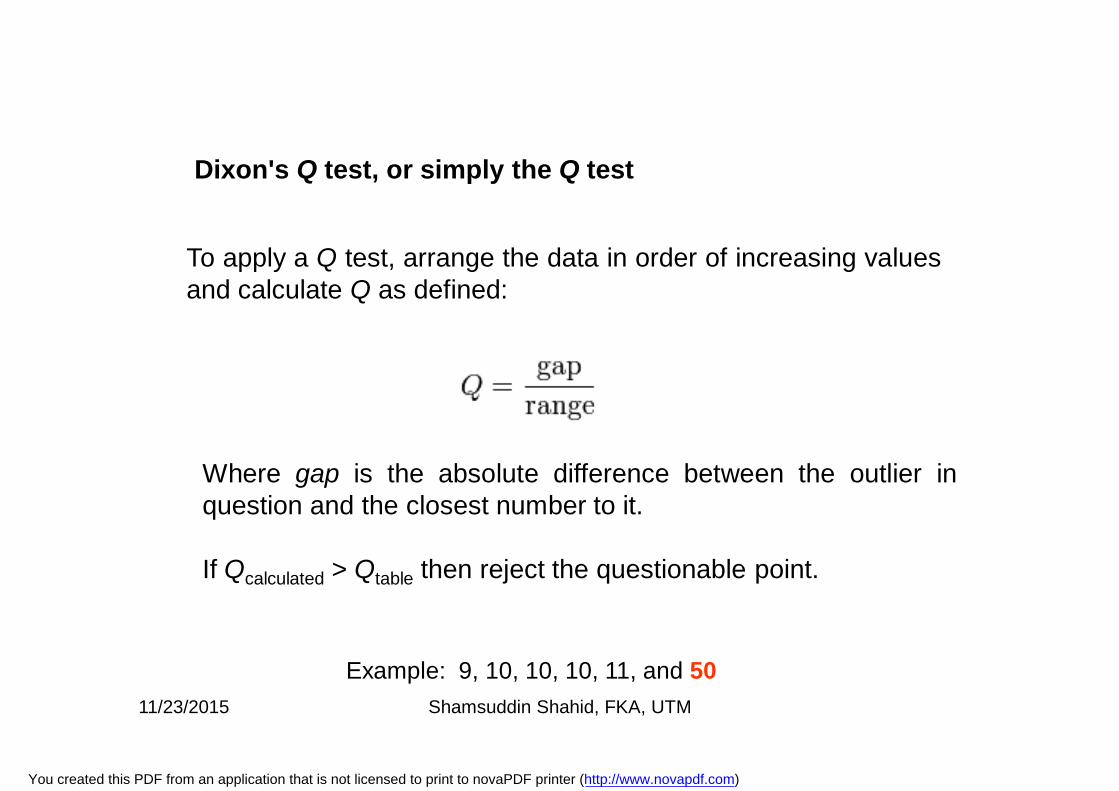
To apply a Q test, arrange the data in order of increasing valuesand calculate Q as defined:
Where gap is the absolute difference between the outlier inquestion and the closest number to it.
If Qcalculated > Qtable then reject the questionable point.
Dixon's Q test, or simply the Q test
Example: 9, 10, 10, 10, 11, and 5011/23/2015 Shamsuddin Shahid, FKA, UTM
You created this PDF from an application that is not licensed to print to novaPDF printer (http://www.novapdf.com)
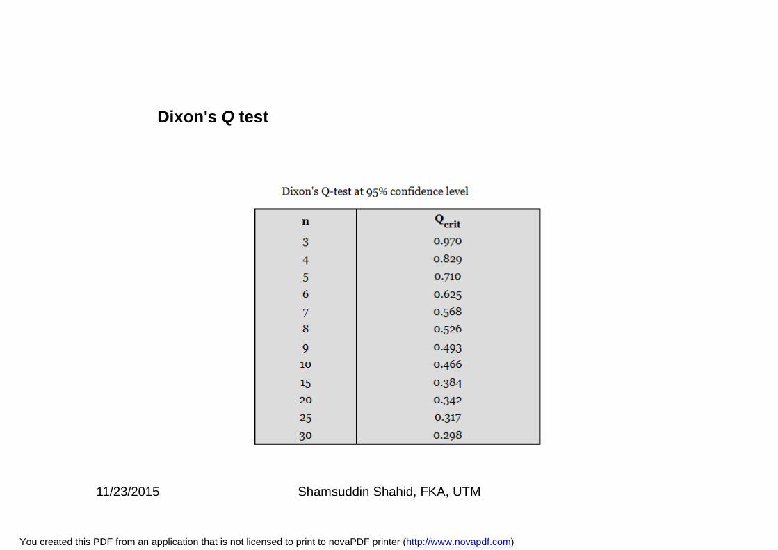
Dixon's Q test
11/23/2015 Shamsuddin Shahid, FKA, UTM
You created this PDF from an application that is not licensed to print to novaPDF printer (http://www.novapdf.com)
Common Characteristics of Water Resources Data
1. A lower bound of zero. No negative values are possible.2. Presence of 'outliers‘ regularly occur, specially outliers on the
high side are more common in water resources.3. Non-normal distribution of data4. Positive skewness is common.5. Data reported only as below or above some threshold
(censored data). Examples include concentrations below one ormore detection limits, annual flood above a level, etc.
6. Seasonal patterns. Values tend to be higher or lower in certainseasons of the year.
7. Positive autocorrelation. Consecutive observations tend to bestrongly correlated with each other. High values tend to followhigh values and low values tend to follow low values.
8. Dependence on other uncontrolled variables. Water dischargefrom a well highly depends on hydraulic conductivity, sedimentgrain size, or some other variable.
11/23/2015 Shamsuddin Shahid, FKA, UTM
You created this PDF from an application that is not licensed to print to novaPDF printer (http://www.novapdf.com)
Graphical Data Analysis
1. Data type2. Mean, median and Mode3. Data quality control4. Outliers5. Nature of Hydrological Data
11/23/2015 Shamsuddin Shahid, FKA, UTM
You created this PDF from an application that is not licensed to print to novaPDF printer (http://www.novapdf.com)
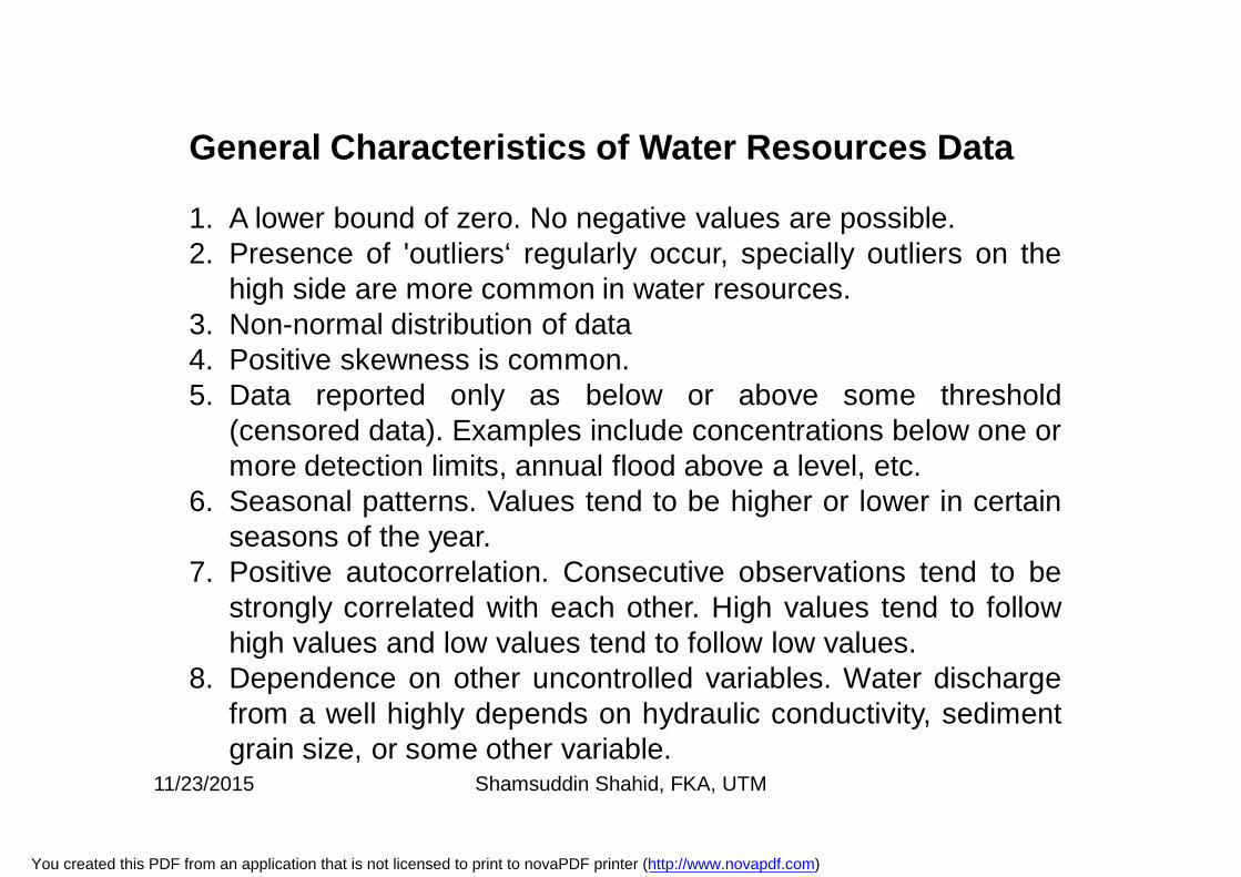
General Characteristics of Water Resources Data
1. A lower bound of zero. No negative values are possible.2. Presence of 'outliers‘ regularly occur, specially outliers on the
high side are more common in water resources.3. Non-normal distribution of data4. Positive skewness is common.5. Data reported only as below or above some threshold
(censored data). Examples include concentrations below one ormore detection limits, annual flood above a level, etc.
6. Seasonal patterns. Values tend to be higher or lower in certainseasons of the year.
7. Positive autocorrelation. Consecutive observations tend to bestrongly correlated with each other. High values tend to followhigh values and low values tend to follow low values.
8. Dependence on other uncontrolled variables. Water dischargefrom a well highly depends on hydraulic conductivity, sedimentgrain size, or some other variable.
11/23/2015 Shamsuddin Shahid, FKA, UTM
You created this PDF from an application that is not licensed to print to novaPDF printer (http://www.novapdf.com)
1. Histogram2. Scatter Plot3. Box-Plot4. Quantile Plot5. Q-Q Plots6. Enhancement of data presentation7. Presentation of multivariate data.
Graphical Data Analysis
11/23/2015 Shamsuddin Shahid, FKA, UTM
You created this PDF from an application that is not licensed to print to novaPDF printer (http://www.novapdf.com)
Exploratory Data Analysis (EDA) is an approach/philosophy fordata analysis that employs a variety of techniques (mostlygraphical) to maximize insight into a data set, uncoverunderlying structure, extract important variables, detect outliersand anomalies, test underlying assumptions, etc.
The EDA approach is an approach, not a set of techniques, butan attitude/philosophy about how a data analysis should becarried out.
EDA is a philosophy as to how we dissect a data set; what welook for; how we look; and how we interpret.
Exploratory Data Analysis
11/23/2015 Shamsuddin Shahid, FKA, UTM
You created this PDF from an application that is not licensed to print to novaPDF printer (http://www.novapdf.com)
Data SummarizationA summary analysis is simply a numeric reduction of a data set. It isquite passive. Quite commonly, its purpose is to simply arrive at afew key statistics (for example, mean and standard deviation) whichmay then either replace the data set or be added to the data set inthe form of a summary table.
Exploratory Data AnalysisIn contrast, EDA has as its broadest goal the desire to gain insightinto the engineering/scientific process behind the data. EDA usesthe data to peer into the heart of the process that generated thedata. There is an archival role in the research for summarystatistics, but there is an enormously larger role for the EDAapproach.
Summarization and Exploratory data analysis
11/23/2015 Shamsuddin Shahid, FKA, UTM
You created this PDF from an application that is not licensed to print to novaPDF printer (http://www.novapdf.com)
Exploratory data analysis
Exploratory data analysis mostly depends on graphical analysis.
The particular graphical techniques employed in EDA are oftenquite simple, consisting of various techniques of:
Plotting the raw data (such as histograms, scatter plots, etc.)
Plotting simple statistics such as mean plots, standard deviationplots, box plots, and main effects plots of the raw data.
11/23/2015 Shamsuddin Shahid, FKA, UTM
You created this PDF from an application that is not licensed to print to novaPDF printer (http://www.novapdf.com)
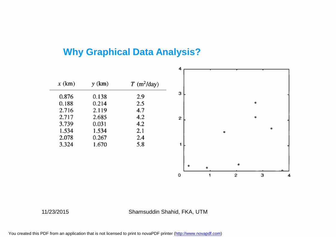
Data analysis and interpretation cannot be completely automated,particularly when making crucial modeling choices. The analystmust use judgment and make decisions that require familiaritywith the data, the site, and the questions that need to beanswered.
The analysis of data typically starts by plotting the data andcalculating statistics that describe important characteristics ofthe sample.
It does little help if we just look at tabulated data. However, thehuman eye can recognize patterns from graphical displays of thedata.
We perform such an exploratory analysis to:
1. familiarize ourselves with the data and2. detect patterns of regularity.
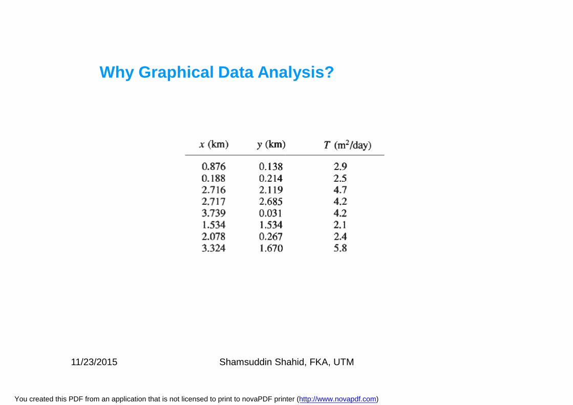
Why Graphical Data Analysis?
11/23/2015 Shamsuddin Shahid, FKA, UTM
You created this PDF from an application that is not licensed to print to novaPDF printer (http://www.novapdf.com)
Why Graphical Data Analysis?
11/23/2015 Shamsuddin Shahid, FKA, UTM
You created this PDF from an application that is not licensed to print to novaPDF printer (http://www.novapdf.com)
Why Graphical Data Analysis?
11/23/2015 Shamsuddin Shahid, FKA, UTM
You created this PDF from an application that is not licensed to print to novaPDF printer (http://www.novapdf.com)
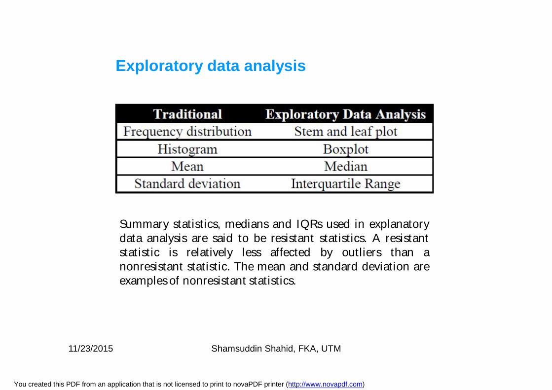
Summary statistics, medians and IQRs used in explanatorydata analysis are said to be resistant statistics. A resistantstatistic is relatively less affected by outliers than anonresistant statistic. The mean and standard deviation areexamples of nonresistant statistics.
Exploratory data analysis
11/23/2015 Shamsuddin Shahid, FKA, UTM
You created this PDF from an application that is not licensed to print to novaPDF printer (http://www.novapdf.com)
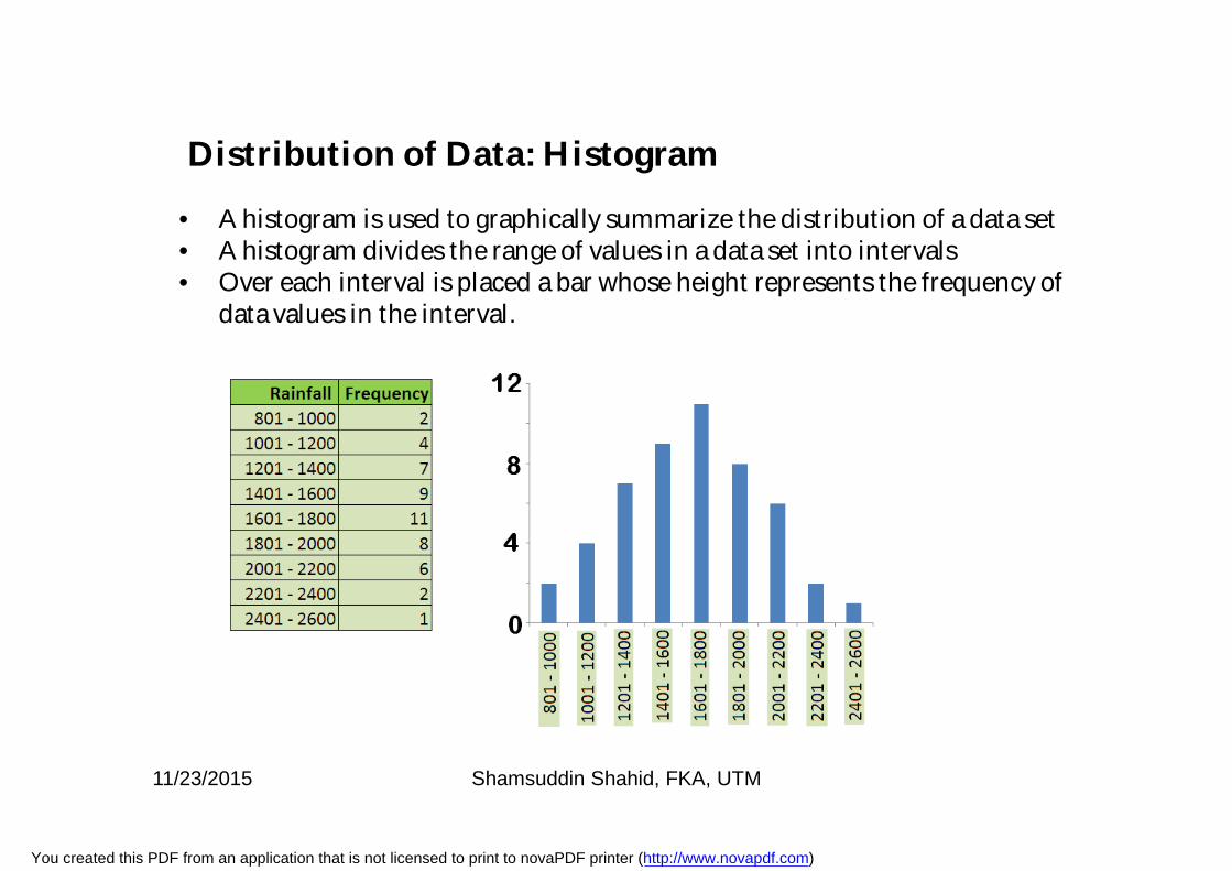
Distribution of Data: Histogram
• A histogram is used to graphically summarize the distribution of a data set• A histogram divides the range of values in a data set into intervals• Over each interval is placed a bar whose height represents the frequency of
data values in the interval.
11/23/2015 Shamsuddin Shahid, FKA, UTM
You created this PDF from an application that is not licensed to print to novaPDF printer (http://www.novapdf.com)
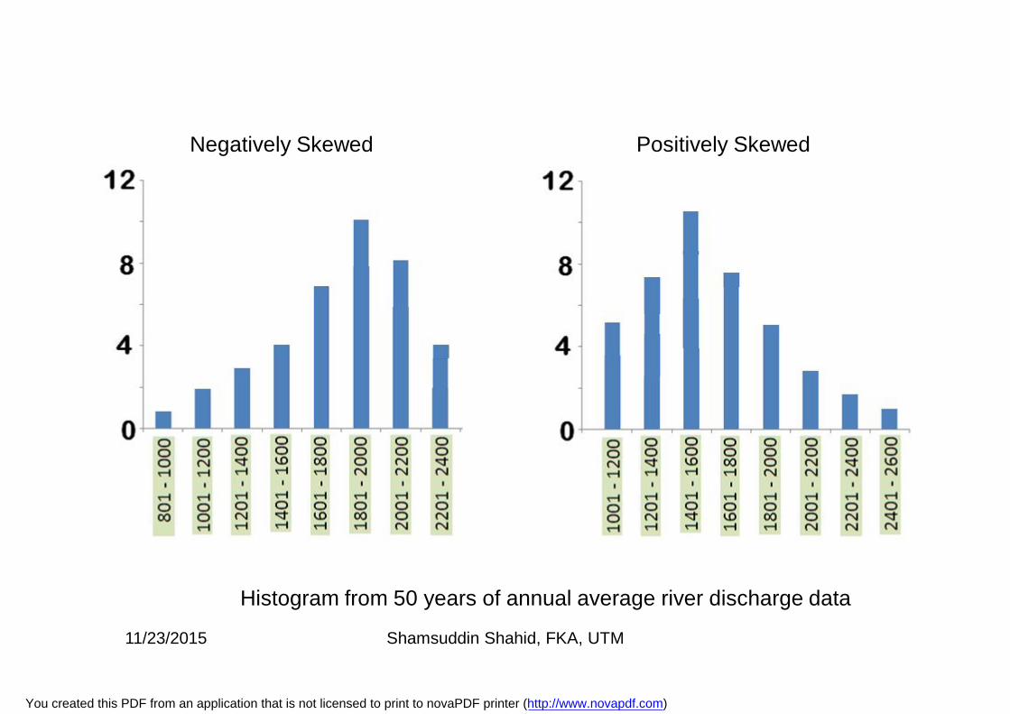
Negatively Skewed Positively Skewed
Histogram from 50 years of annual average river discharge data
11/23/2015 Shamsuddin Shahid, FKA, UTM
You created this PDF from an application that is not licensed to print to novaPDF printer (http://www.novapdf.com)
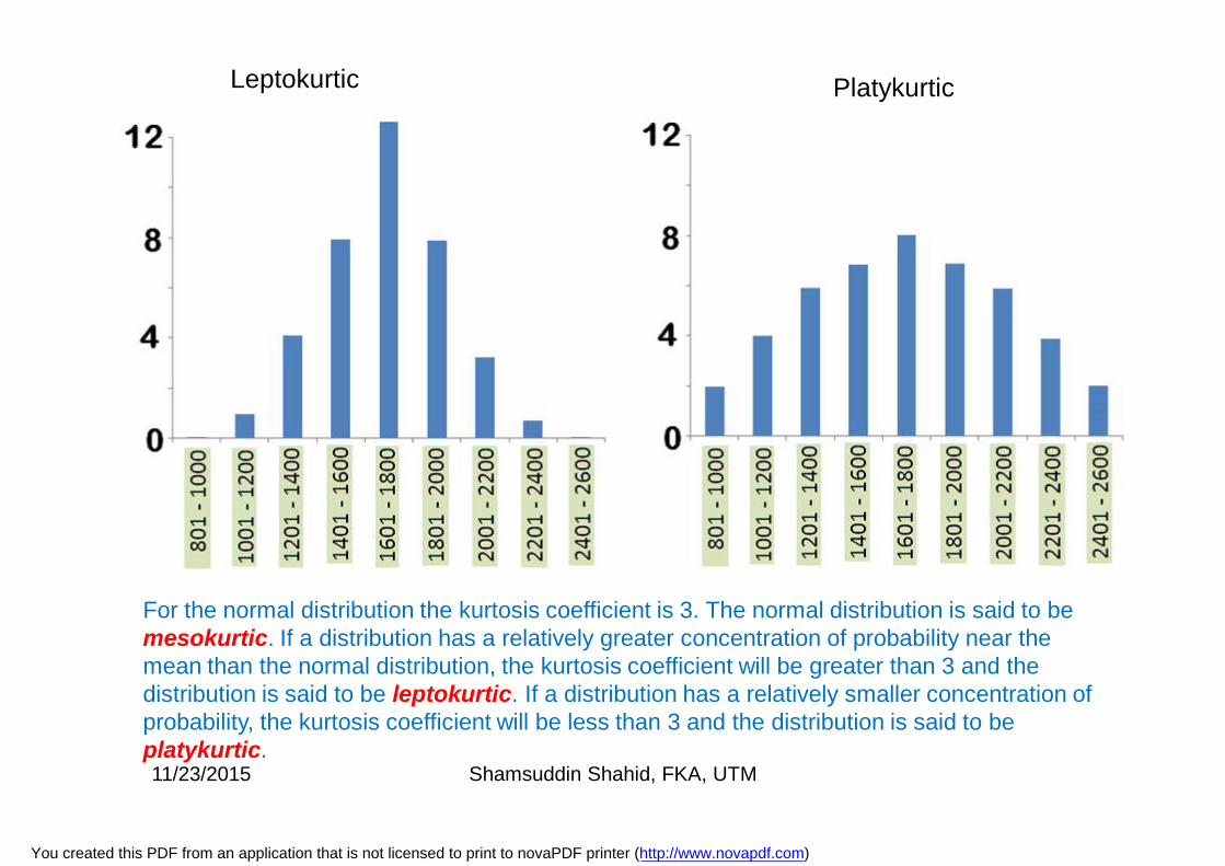
PlatykurticLeptokurtic
For the normal distribution the kurtosis coefficient is 3. The normal distribution is said to be mesokurtic. If a distribution has a relatively greater concentration of probability near the mean than the normal distribution, the kurtosis coefficient will be greater than 3 and the distribution is said to be leptokurtic. If a distribution has a relatively smaller concentration of probability, the kurtosis coefficient will be less than 3 and the distribution is said to be platykurtic. 11/23/2015 Shamsuddin Shahid, FKA, UTM
You created this PDF from an application that is not licensed to print to novaPDF printer (http://www.novapdf.com)
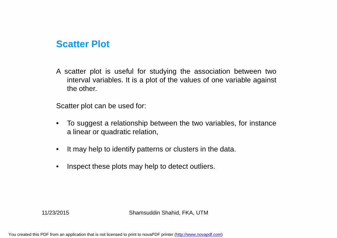
Scatter Plot
A scatter plot is useful for studying the association between twointerval variables. It is a plot of the values of one variable againstthe other.
Scatter plot can be used for:
• To suggest a relationship between the two variables, for instancea linear or quadratic relation,
• It may help to identify patterns or clusters in the data.
• Inspect these plots may help to detect outliers.
11/23/2015 Shamsuddin Shahid, FKA, UTM
You created this PDF from an application that is not licensed to print to novaPDF printer (http://www.novapdf.com)
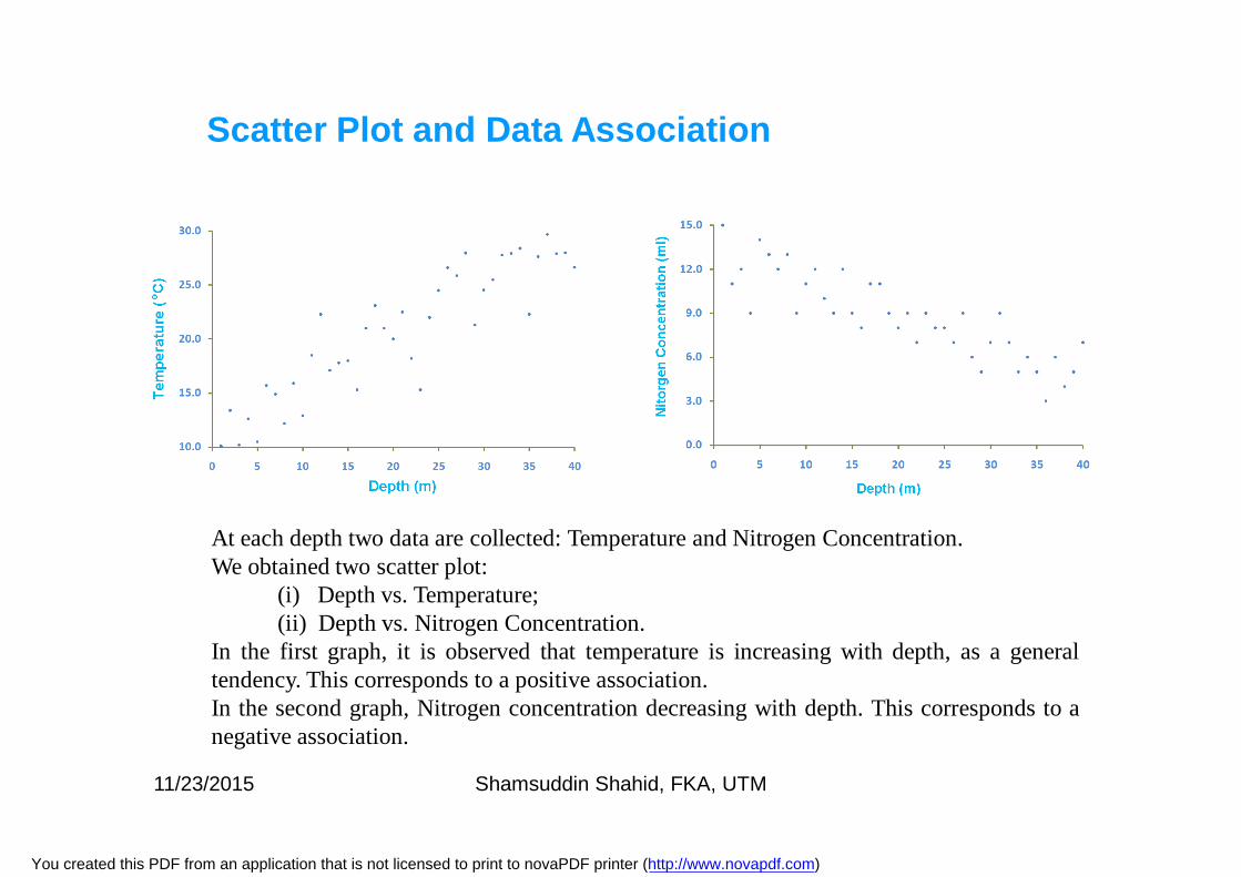
At each depth two data are collected: Temperature and Nitrogen Concentration.We obtained two scatter plot:
(i) Depth vs. Temperature;(ii) Depth vs. Nitrogen Concentration.
In the first graph, it is observed that temperature is increasing with depth, as a generaltendency. This corresponds to a positive association.In the second graph, Nitrogen concentration decreasing with depth. This corresponds to anegative association.
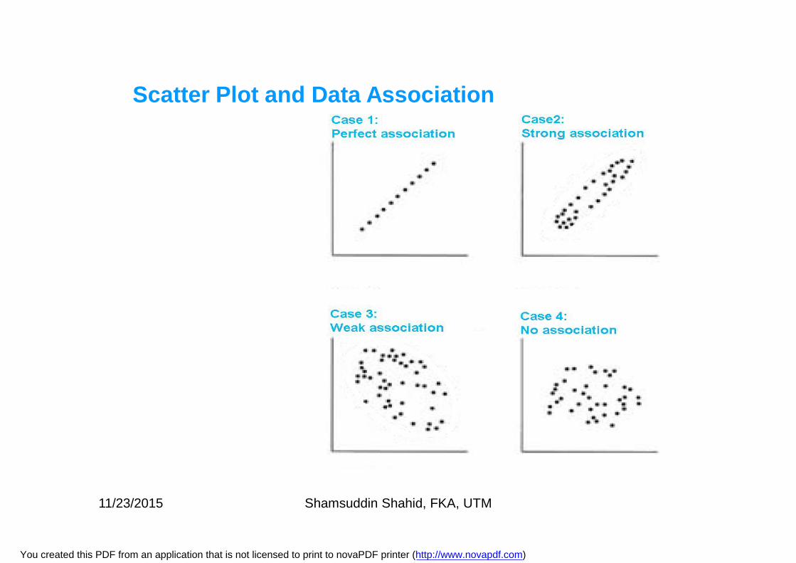
Scatter Plot and Data Association
11/23/2015 Shamsuddin Shahid, FKA, UTM
You created this PDF from an application that is not licensed to print to novaPDF printer (http://www.novapdf.com)
Scatter Plot and Data Association
11/23/2015 Shamsuddin Shahid, FKA, UTM
You created this PDF from an application that is not licensed to print to novaPDF printer (http://www.novapdf.com)
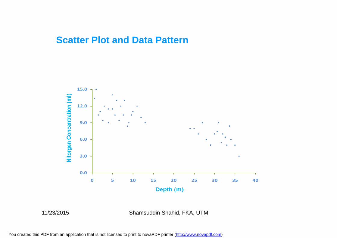
Scatter Plot and Data Pattern
11/23/2015 Shamsuddin Shahid, FKA, UTM
You created this PDF from an application that is not licensed to print to novaPDF printer (http://www.novapdf.com)
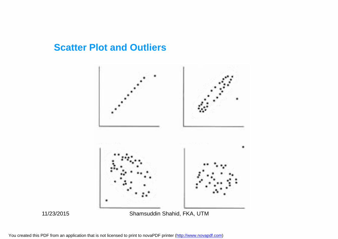
Scatter Plot and Outliers
11/23/2015 Shamsuddin Shahid, FKA, UTM
You created this PDF from an application that is not licensed to print to novaPDF printer (http://www.novapdf.com)
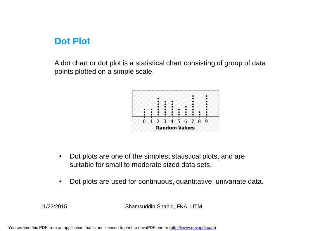
A dot chart or dot plot is a statistical chart consisting of group of data points plotted on a simple scale.
Dot Plot
• Dot plots are one of the simplest statistical plots, and are suitable for small to moderate sized data sets.
• Dot plots are used for continuous, quantitative, univariate data.
11/23/2015 Shamsuddin Shahid, FKA, UTM
You created this PDF from an application that is not licensed to print to novaPDF printer (http://www.novapdf.com)
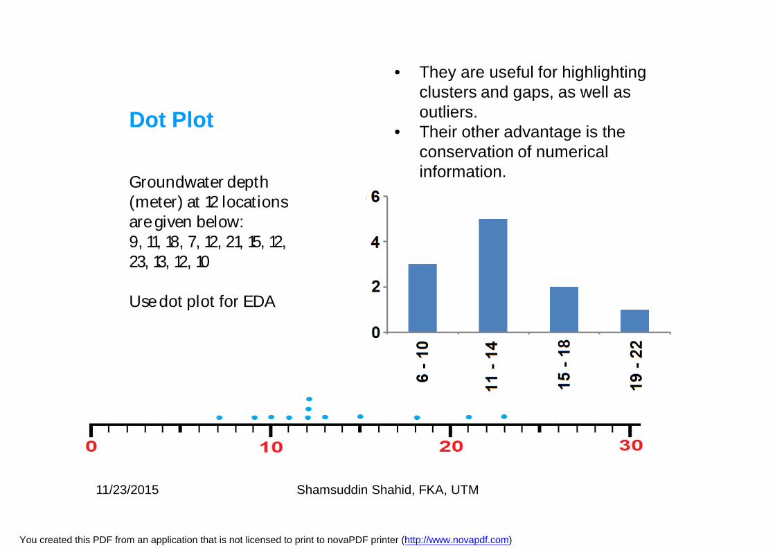
Groundwater depth (meter) at 12 locations are given below:9, 11, 18, 7, 12, 21, 15, 12, 23, 13, 12, 10
Use dot plot for EDA
Dot Plot
• They are useful for highlighting clusters and gaps, as well as outliers.
• Their other advantage is the conservation of numerical information.
11/23/2015 Shamsuddin Shahid, FKA, UTM
You created this PDF from an application that is not licensed to print to novaPDF printer (http://www.novapdf.com)
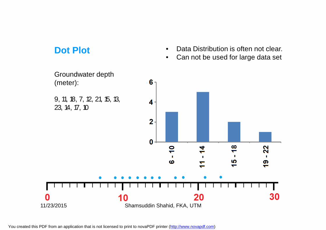
Groundwater depth (meter):
9, 11, 18, 7, 12, 21, 15, 13, 23, 14, 17, 10
Dot Plot • Data Distribution is often not clear. • Can not be used for large data set
11/23/2015 Shamsuddin Shahid, FKA, UTM
You created this PDF from an application that is not licensed to print to novaPDF printer (http://www.novapdf.com)
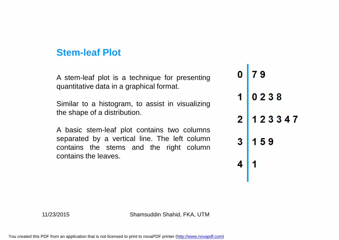
A stem-leaf plot is a technique for presentingquantitative data in a graphical format.
Similar to a histogram, to assist in visualizingthe shape of a distribution.
A basic stem-leaf plot contains two columnsseparated by a vertical line. The left columncontains the stems and the right columncontains the leaves.
Stem-leaf Plot
11/23/2015 Shamsuddin Shahid, FKA, UTM
You created this PDF from an application that is not licensed to print to novaPDF printer (http://www.novapdf.com)
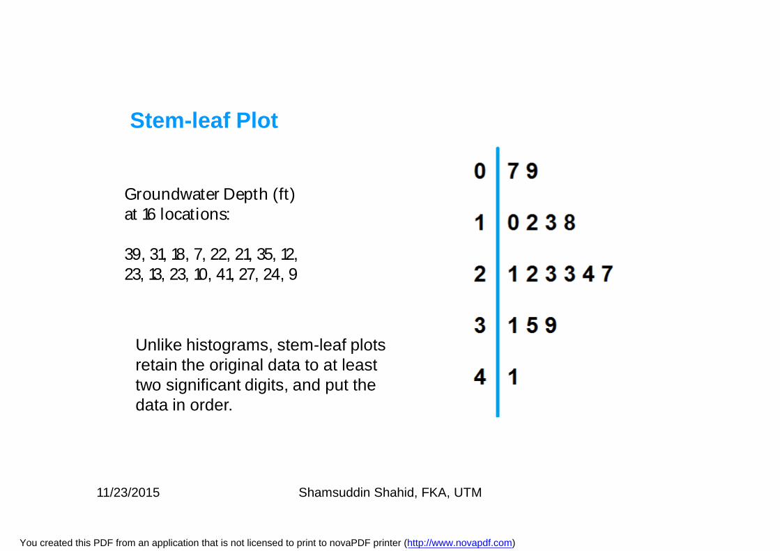
Groundwater Depth (ft) at 16 locations:
39, 31, 18, 7, 22, 21, 35, 12, 23, 13, 23, 10, 41, 27, 24, 9
Stem-leaf Plot
Unlike histograms, stem-leaf plots retain the original data to at least two significant digits, and put the data in order.
11/23/2015 Shamsuddin Shahid, FKA, UTM
You created this PDF from an application that is not licensed to print to novaPDF printer (http://www.novapdf.com)
Stem-leaf Plot
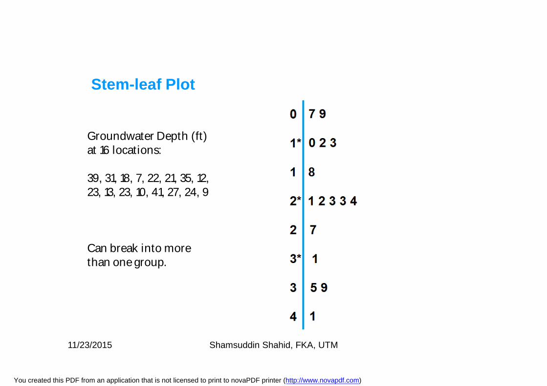
Groundwater Depth (ft) at 16 locations:
39, 31, 18, 7, 22, 21, 35, 12, 23, 13, 23, 10, 41, 27, 24, 9
Can break into more than one group.
11/23/2015 Shamsuddin Shahid, FKA, UTM
You created this PDF from an application that is not licensed to print to novaPDF printer (http://www.novapdf.com)
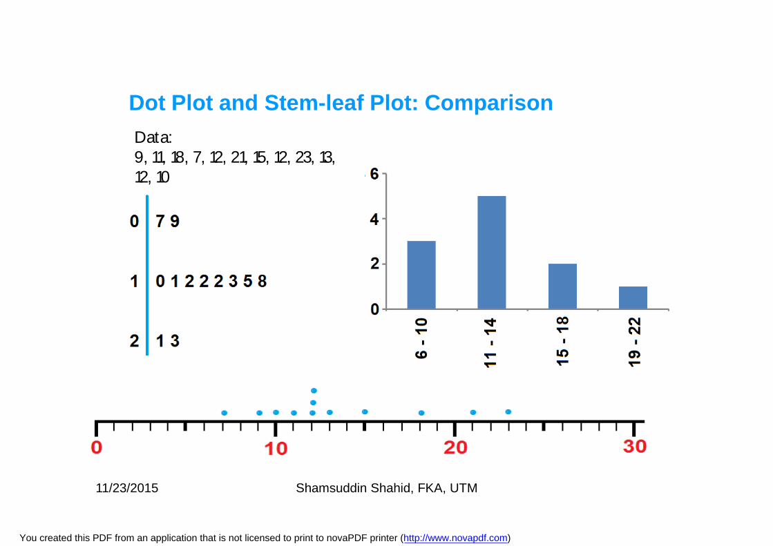
Data: 9, 11, 18, 7, 12, 21, 15, 12, 23, 13, 12, 10
Dot Plot and Stem-leaf Plot: Comparison
11/23/2015 Shamsuddin Shahid, FKA, UTM
You created this PDF from an application that is not licensed to print to novaPDF printer (http://www.novapdf.com)
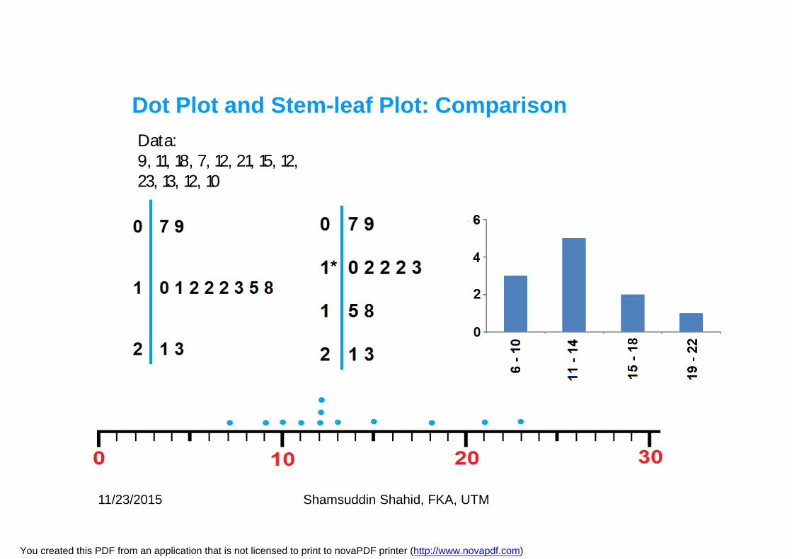
Data: 9, 11, 18, 7, 12, 21, 15, 12, 23, 13, 12, 10
Dot Plot and Stem-leaf Plot: Comparison
11/23/2015 Shamsuddin Shahid, FKA, UTM
You created this PDF from an application that is not licensed to print to novaPDF printer (http://www.novapdf.com)
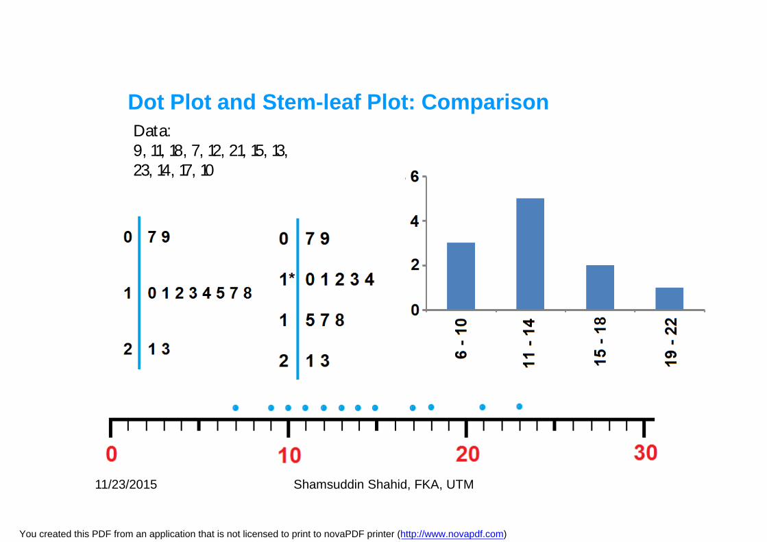
Data:9, 11, 18, 7, 12, 21, 15, 13, 23, 14, 17, 10
Dot Plot and Stem-leaf Plot: Comparison
11/23/2015 Shamsuddin Shahid, FKA, UTM
You created this PDF from an application that is not licensed to print to novaPDF printer (http://www.novapdf.com)
• Stem-leaf plots are useful for displaying the relative density andshape of the data, giving the reader a quick overview ofdistribution.
• They retain (most of) the raw numerical data, often with perfectintegrity.
• They are also useful for highlighting outliers and finding themode.
• However, stem and leaf plots are only useful for moderatelysized data sets (around 15-150 data points).
• With very small data sets a stem and leaf plot can be of littleuse, as a reasonable number of data points are required toestablish definitive distribution properties.
Stem-leaf Plot
11/23/2015 Shamsuddin Shahid, FKA, UTM
You created this PDF from an application that is not licensed to print to novaPDF printer (http://www.novapdf.com)
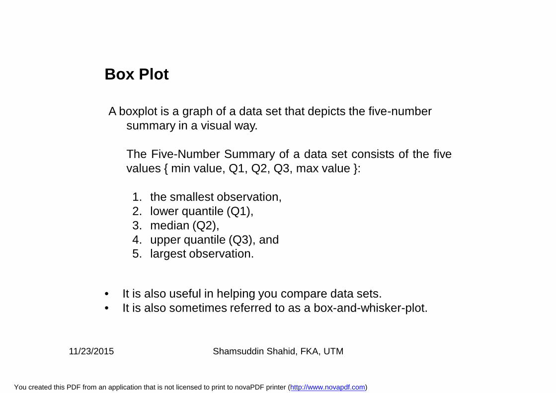
A boxplot is a graph of a data set that depicts the five-number summary in a visual way.
The Five-Number Summary of a data set consists of the fivevalues { min value, Q1, Q2, Q3, max value }:
1. the smallest observation, 2. lower quantile (Q1), 3. median (Q2), 4. upper quantile (Q3), and 5. largest observation.
Box Plot
• It is also useful in helping you compare data sets. • It is also sometimes referred to as a box-and-whisker-plot.
11/23/2015 Shamsuddin Shahid, FKA, UTM
You created this PDF from an application that is not licensed to print to novaPDF printer (http://www.novapdf.com)
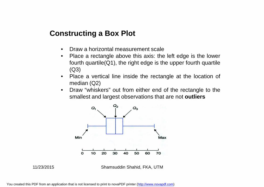
• Draw a horizontal measurement scale• Place a rectangle above this axis: the left edge is the lower
fourth quartile(Q1), the right edge is the upper fourth quartile(Q3)
• Place a vertical line inside the rectangle at the location ofmedian (Q2)
• Draw “whiskers” out from either end of the rectangle to thesmallest and largest observations that are not outliers
Constructing a Box Plot
11/23/2015 Shamsuddin Shahid, FKA, UTM
You created this PDF from an application that is not licensed to print to novaPDF printer (http://www.novapdf.com)
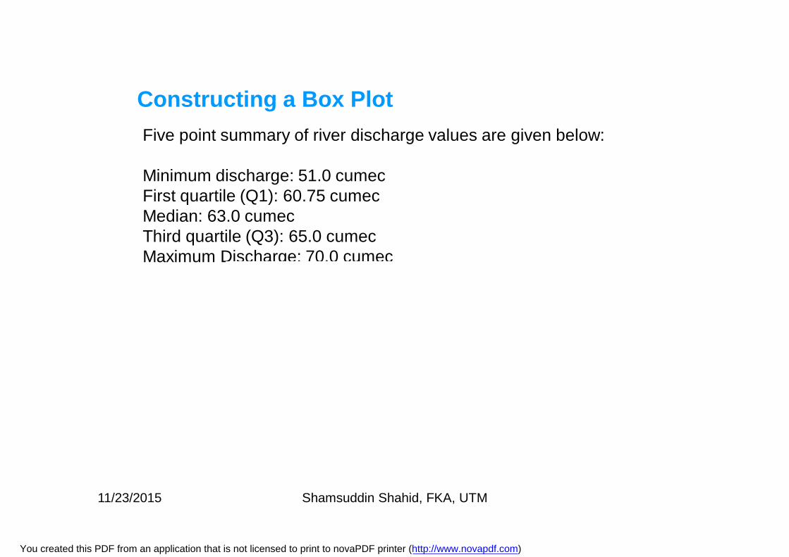
Five point summary of river discharge values are given below:
Minimum discharge: 51.0 cumecFirst quartile (Q1): 60.75 cumecMedian: 63.0 cumecThird quartile (Q3): 65.0 cumecMaximum Discharge: 70.0 cumec
Constructing a Box Plot
11/23/2015 Shamsuddin Shahid, FKA, UTM
You created this PDF from an application that is not licensed to print to novaPDF printer (http://www.novapdf.com)
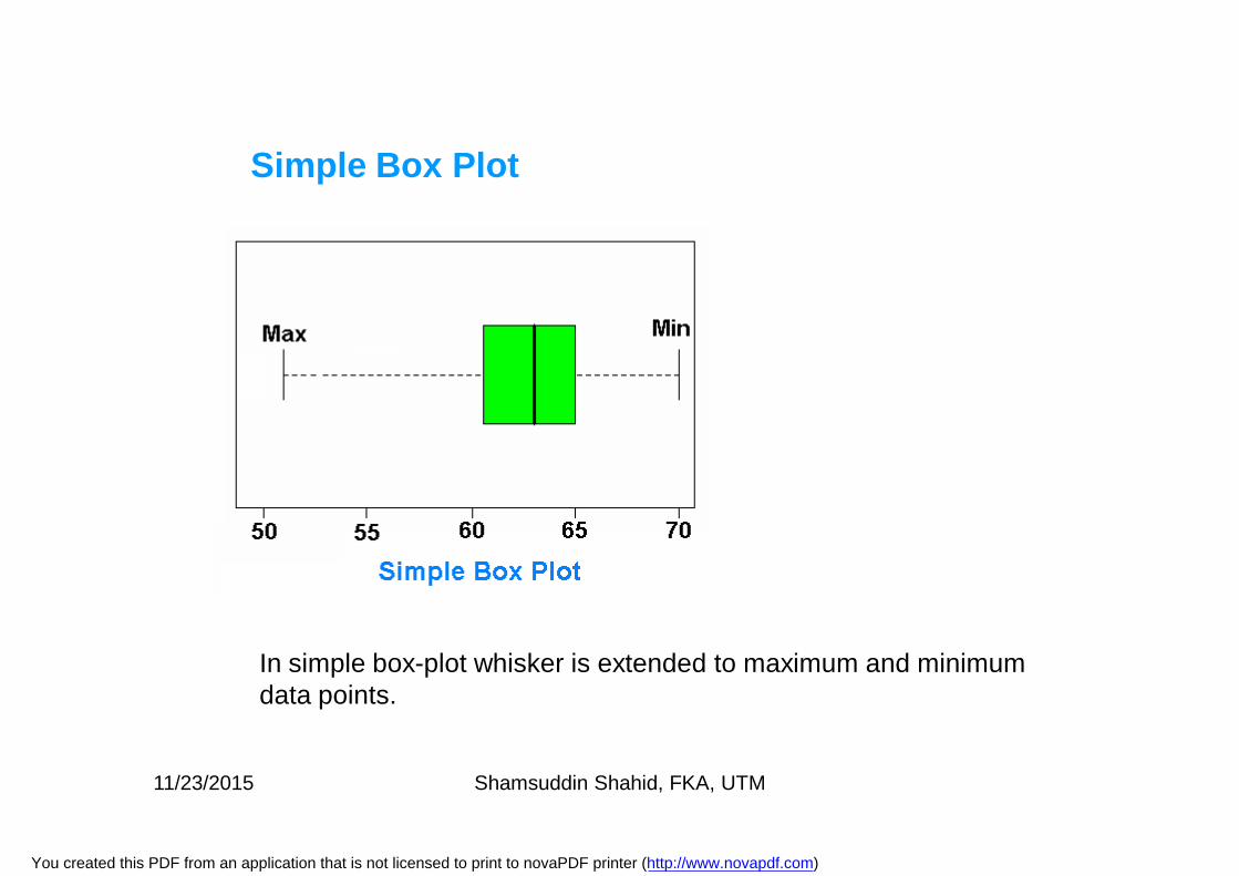
Simple Box Plot
In simple box-plot whisker is extended to maximum and minimum data points.
11/23/2015 Shamsuddin Shahid, FKA, UTM
You created this PDF from an application that is not licensed to print to novaPDF printer (http://www.novapdf.com)
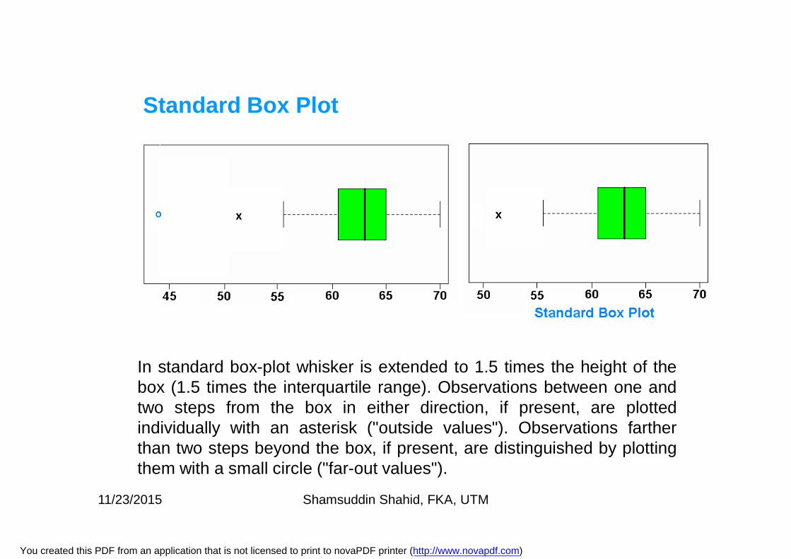
In standard box-plot whisker is extended to 1.5 times the height of thebox (1.5 times the interquartile range). Observations between one andtwo steps from the box in either direction, if present, are plottedindividually with an asterisk ("outside values"). Observations fartherthan two steps beyond the box, if present, are distinguished by plottingthem with a small circle ("far-out values").
Standard Box Plot
11/23/2015 Shamsuddin Shahid, FKA, UTM
You created this PDF from an application that is not licensed to print to novaPDF printer (http://www.novapdf.com)
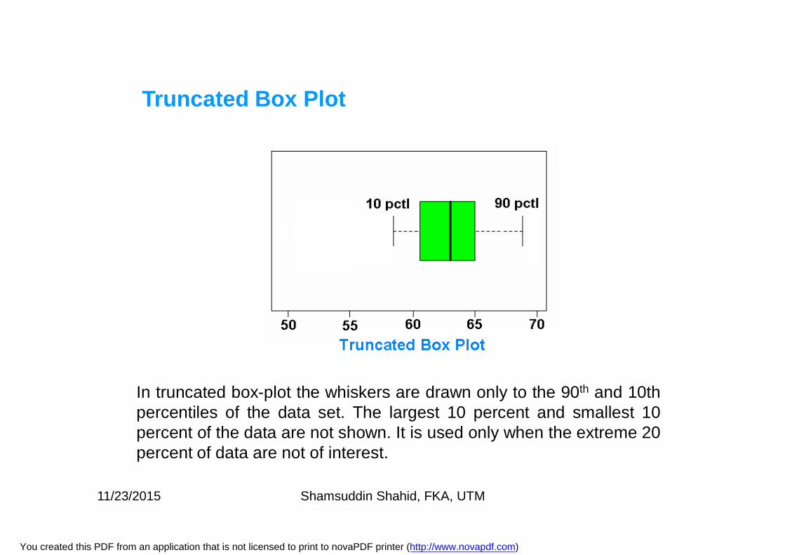
Truncated Box Plot
In truncated box-plot the whiskers are drawn only to the 90th and 10thpercentiles of the data set. The largest 10 percent and smallest 10percent of the data are not shown. It is used only when the extreme 20percent of data are not of interest.
11/23/2015 Shamsuddin Shahid, FKA, UTM
You created this PDF from an application that is not licensed to print to novaPDF printer (http://www.novapdf.com)
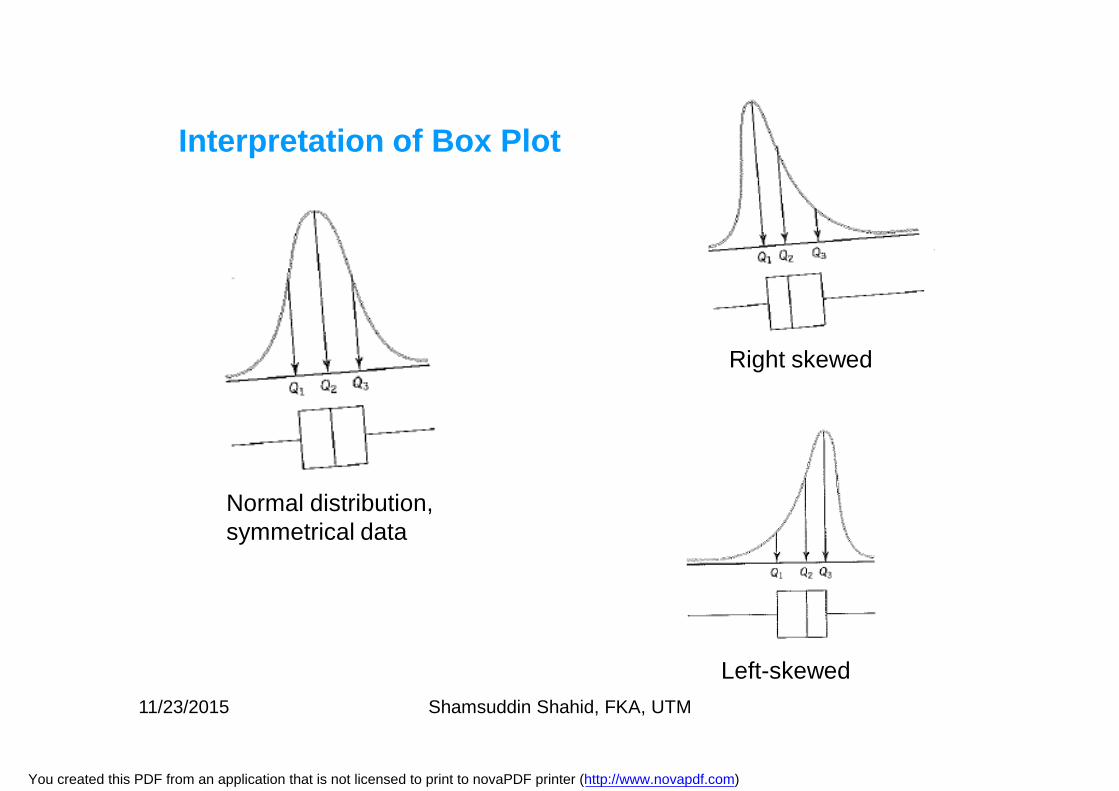
Interpretation of Box Plot
Normal distribution, symmetrical data
Right skewed
Left-skewed11/23/2015 Shamsuddin Shahid, FKA, UTM
You created this PDF from an application that is not licensed to print to novaPDF printer (http://www.novapdf.com)
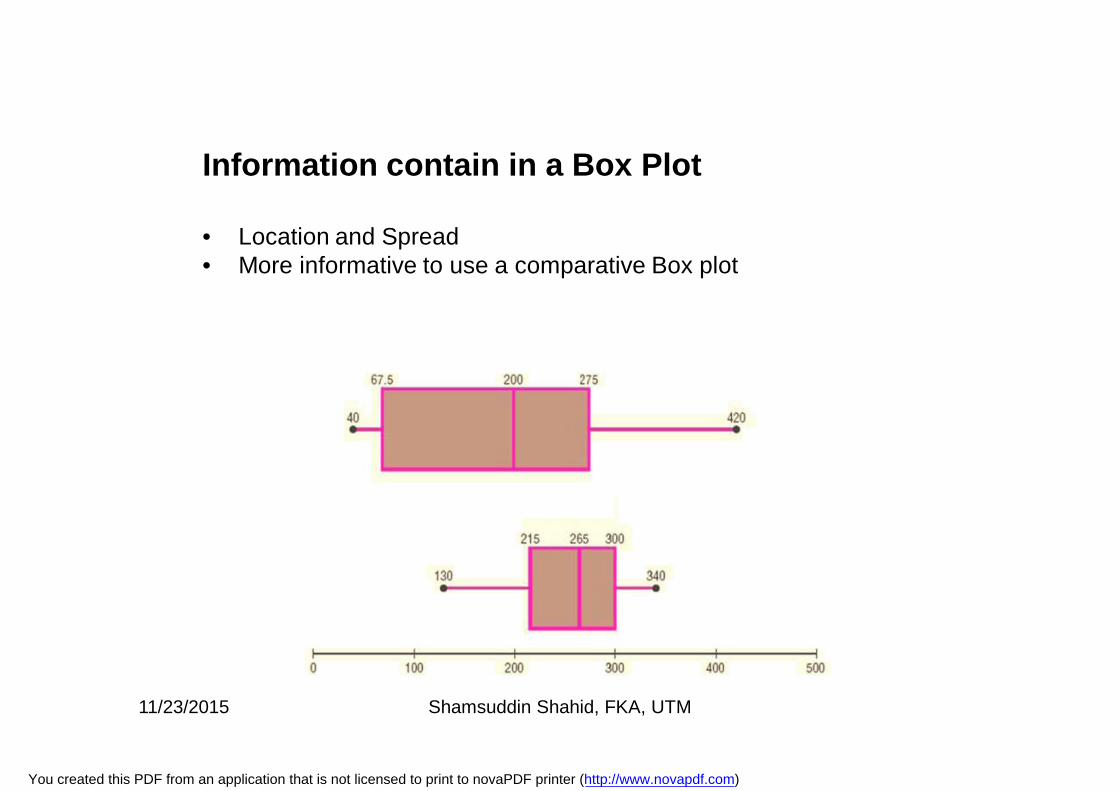
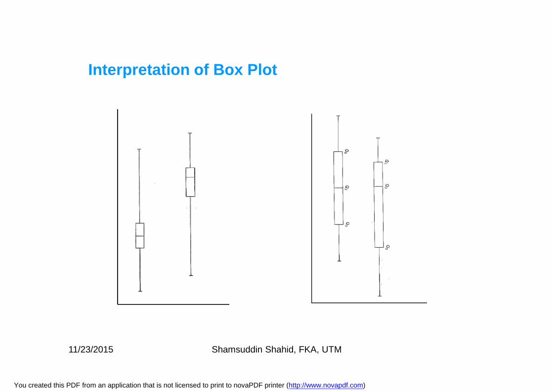
Information contain in a Box Plot
• Location and Spread• More informative to use a comparative Box plot
11/23/2015 Shamsuddin Shahid, FKA, UTM
You created this PDF from an application that is not licensed to print to novaPDF printer (http://www.novapdf.com)
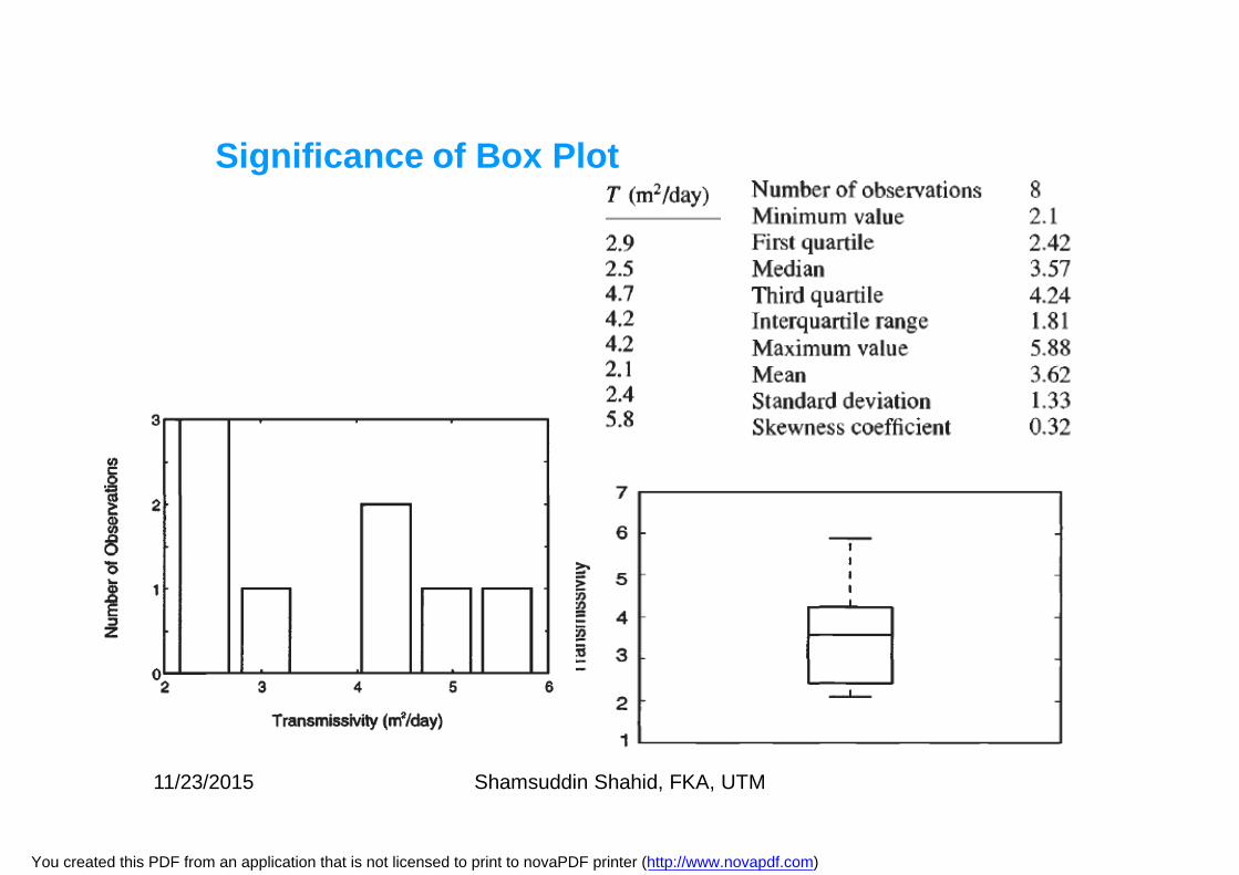
Significance of Box Plot
11/23/2015 Shamsuddin Shahid, FKA, UTM
You created this PDF from an application that is not licensed to print to novaPDF printer (http://www.novapdf.com)
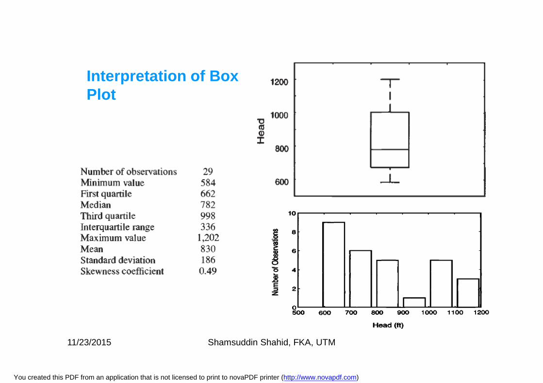
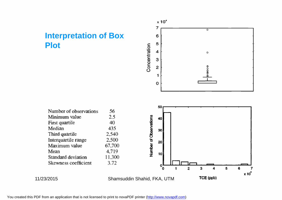
Interpretation of Box Plot
11/23/2015 Shamsuddin Shahid, FKA, UTM
You created this PDF from an application that is not licensed to print to novaPDF printer (http://www.novapdf.com)
Interpretation of Box Plot
11/23/2015 Shamsuddin Shahid, FKA, UTM
You created this PDF from an application that is not licensed to print to novaPDF printer (http://www.novapdf.com)
Interpretation of Box Plot
11/23/2015 Shamsuddin Shahid, FKA, UTM
You created this PDF from an application that is not licensed to print to novaPDF printer (http://www.novapdf.com)
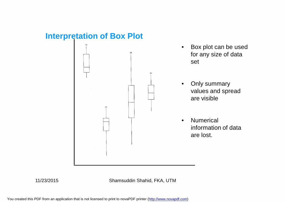
Interpretation of Box Plot• Box plot can be used
for any size of data set
• Only summary values and spread are visible
• Numerical information of data are lost.
11/23/2015 Shamsuddin Shahid, FKA, UTM
You created this PDF from an application that is not licensed to print to novaPDF printer (http://www.novapdf.com)
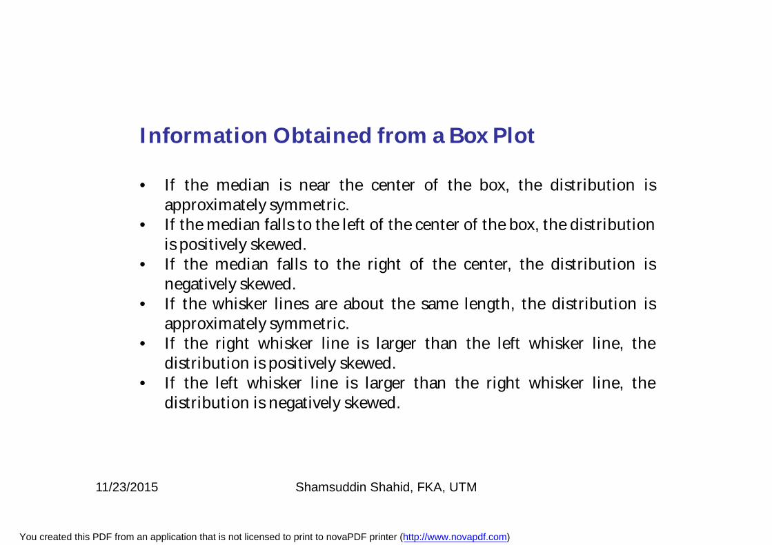
Information Obtained from a Box Plot
• If the median is near the center of the box, the distribution isapproximately symmetric.
• If the median falls to the left of the center of the box, the distributionis positively skewed.
• If the median falls to the right of the center, the distribution isnegatively skewed.
• If the whisker lines are about the same length, the distribution isapproximately symmetric.
• If the right whisker line is larger than the left whisker line, thedistribution is positively skewed.
• If the left whisker line is larger than the right whisker line, thedistribution is negatively skewed.
11/23/2015 Shamsuddin Shahid, FKA, UTM
You created this PDF from an application that is not licensed to print to novaPDF printer (http://www.novapdf.com)
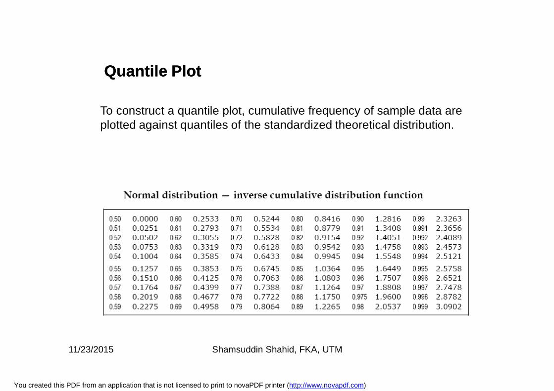
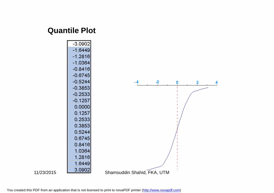
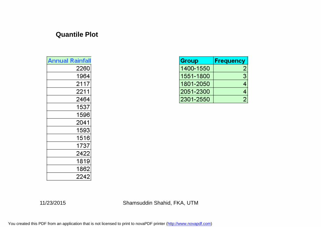
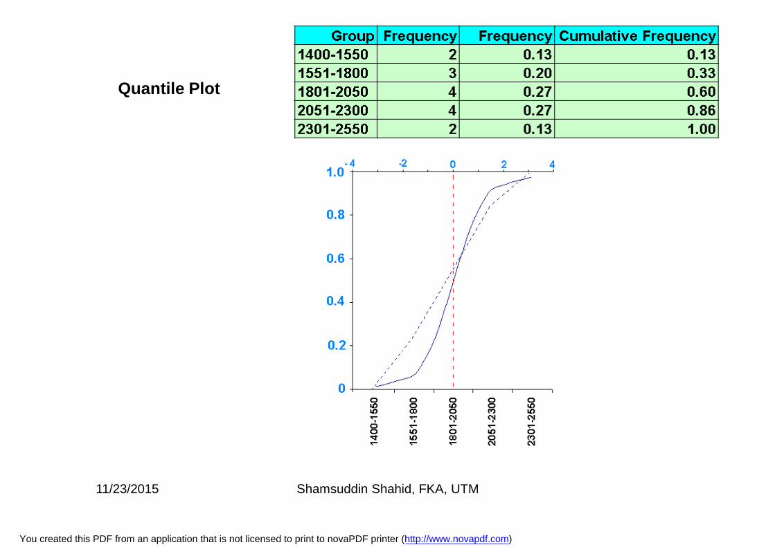
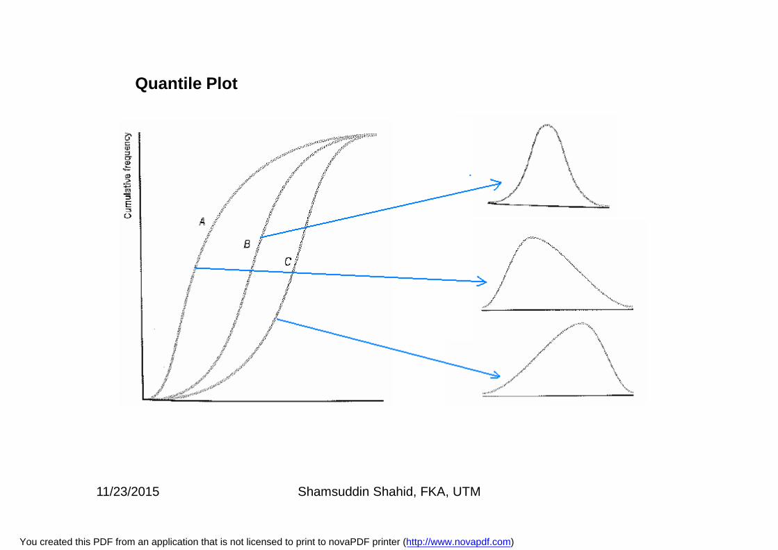
Quantile PlotQuantile Plot
To construct a quantile plot, cumulative frequency of sample data areplotted against quantiles of the standardized theoretical distribution.
11/23/2015 Shamsuddin Shahid, FKA, UTM
You created this PDF from an application that is not licensed to print to novaPDF printer (http://www.novapdf.com)
Quantile Plot
11/23/2015 Shamsuddin Shahid, FKA, UTM
You created this PDF from an application that is not licensed to print to novaPDF printer (http://www.novapdf.com)
Quantile Plot
11/23/2015 Shamsuddin Shahid, FKA, UTM
You created this PDF from an application that is not licensed to print to novaPDF printer (http://www.novapdf.com)
Quantile Plot
11/23/2015 Shamsuddin Shahid, FKA, UTM
You created this PDF from an application that is not licensed to print to novaPDF printer (http://www.novapdf.com)
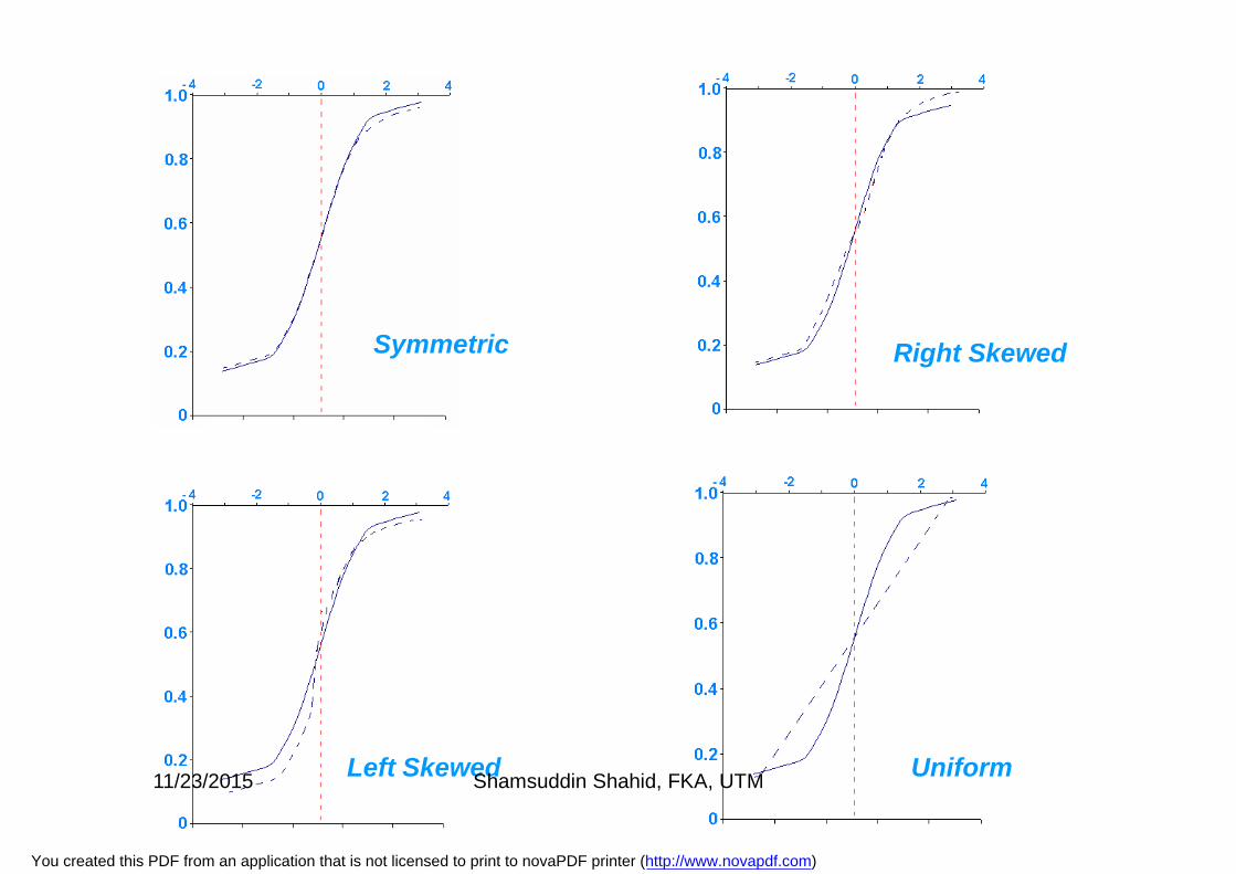
Symmetric Right Skewed
Left Skewed Uniform11/23/2015 Shamsuddin Shahid, FKA, UTM
You created this PDF from an application that is not licensed to print to novaPDF printer (http://www.novapdf.com)
Quantile Plot
11/23/2015 Shamsuddin Shahid, FKA, UTM
You created this PDF from an application that is not licensed to print to novaPDF printer (http://www.novapdf.com)
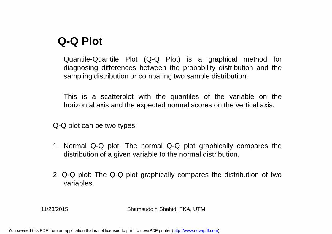
Q-Q PlotQuantile-Quantile Plot (Q-Q Plot) is a graphical method fordiagnosing differences between the probability distribution and thesampling distribution or comparing two sample distribution.
This is a scatterplot with the quantiles of the variable on thehorizontal axis and the expected normal scores on the vertical axis.
Q-Q plot can be two types:
1. Normal Q-Q plot: The normal Q-Q plot graphically compares thedistribution of a given variable to the normal distribution.
2. Q-Q plot: The Q-Q plot graphically compares the distribution of twovariables.
11/23/2015 Shamsuddin Shahid, FKA, UTM
You created this PDF from an application that is not licensed to print to novaPDF printer (http://www.novapdf.com)
• A normal distribution is often a reasonable model for the data.• Without inspecting the data, however, it is risky to assume a
normal distribution.• There are a number of graphs that can be used to check the
deviations of the data from the normal distribution. A histogram isan example of a graph that can be used to check normality. Here,the histogram should reveal a bell shaped curve.
• The most useful tool for assessing normality is a quantile-quantile or QQ plot.
• Q-Q plot is also a important graphical method for identify theoutliers.
• Q-Q plot can also be used to identify the shape of the datadistribution, skewness, etc.
Why normal Q-Q Plot?
11/23/2015 Shamsuddin Shahid, FKA, UTM
You created this PDF from an application that is not licensed to print to novaPDF printer (http://www.novapdf.com)
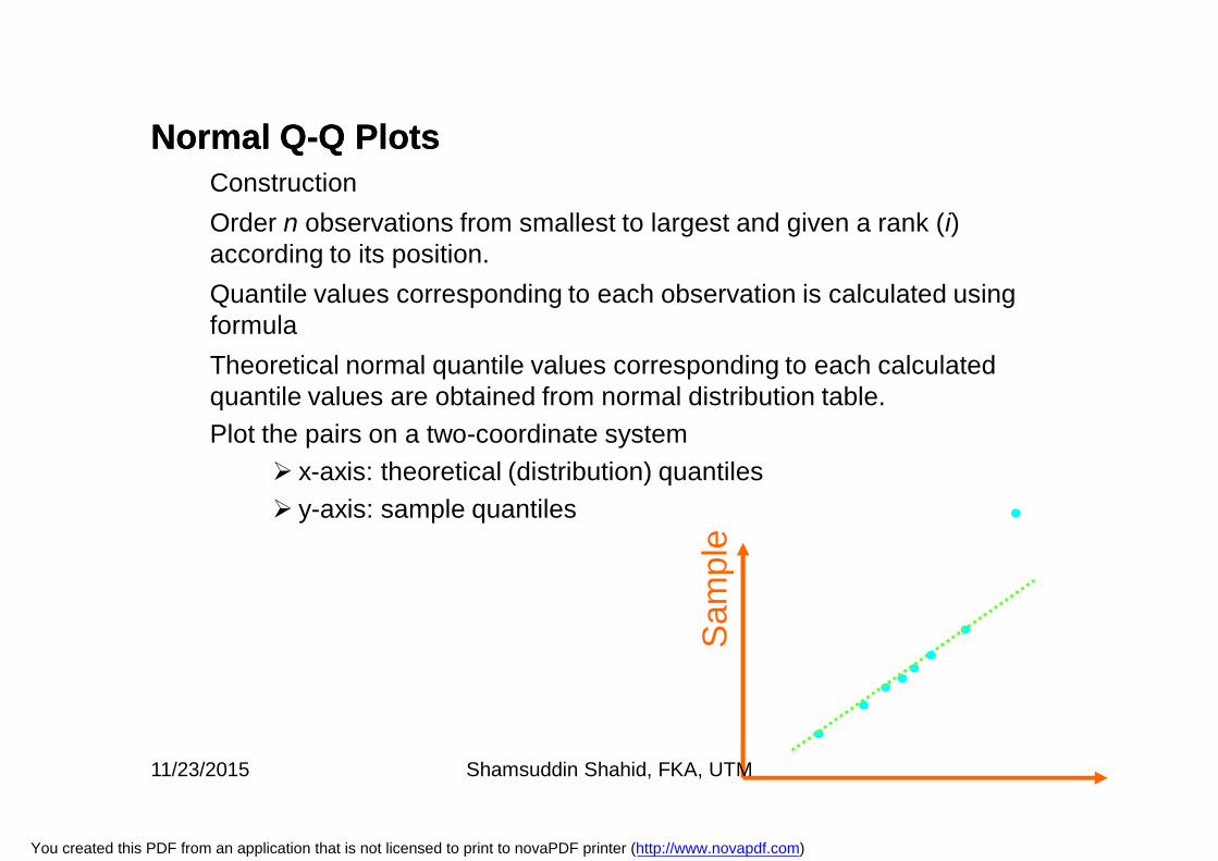
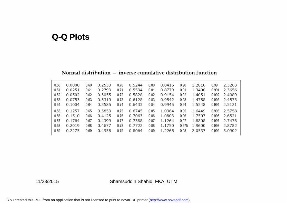
Normal QNormal Q--Q PlotsQ PlotsConstructionOrder n observations from smallest to largest and given a rank (i) according to its position.Quantile values corresponding to each observation is calculated using formulaTheoretical normal quantile values corresponding to each calculated quantile values are obtained from normal distribution table.Plot the pairs on a two-coordinate system
x-axis: theoretical (distribution) quantiles y-axis: sample quantiles
Sam
ple
11/23/2015 Shamsuddin Shahid, FKA, UTM
You created this PDF from an application that is not licensed to print to novaPDF printer (http://www.novapdf.com)
QQ--Q PlotsQ Plots
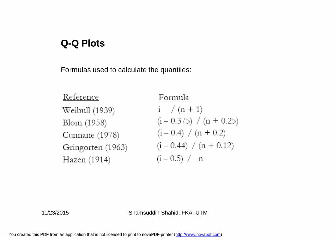
Formulas used to calculate the quantiles:
11/23/2015 Shamsuddin Shahid, FKA, UTM
You created this PDF from an application that is not licensed to print to novaPDF printer (http://www.novapdf.com)
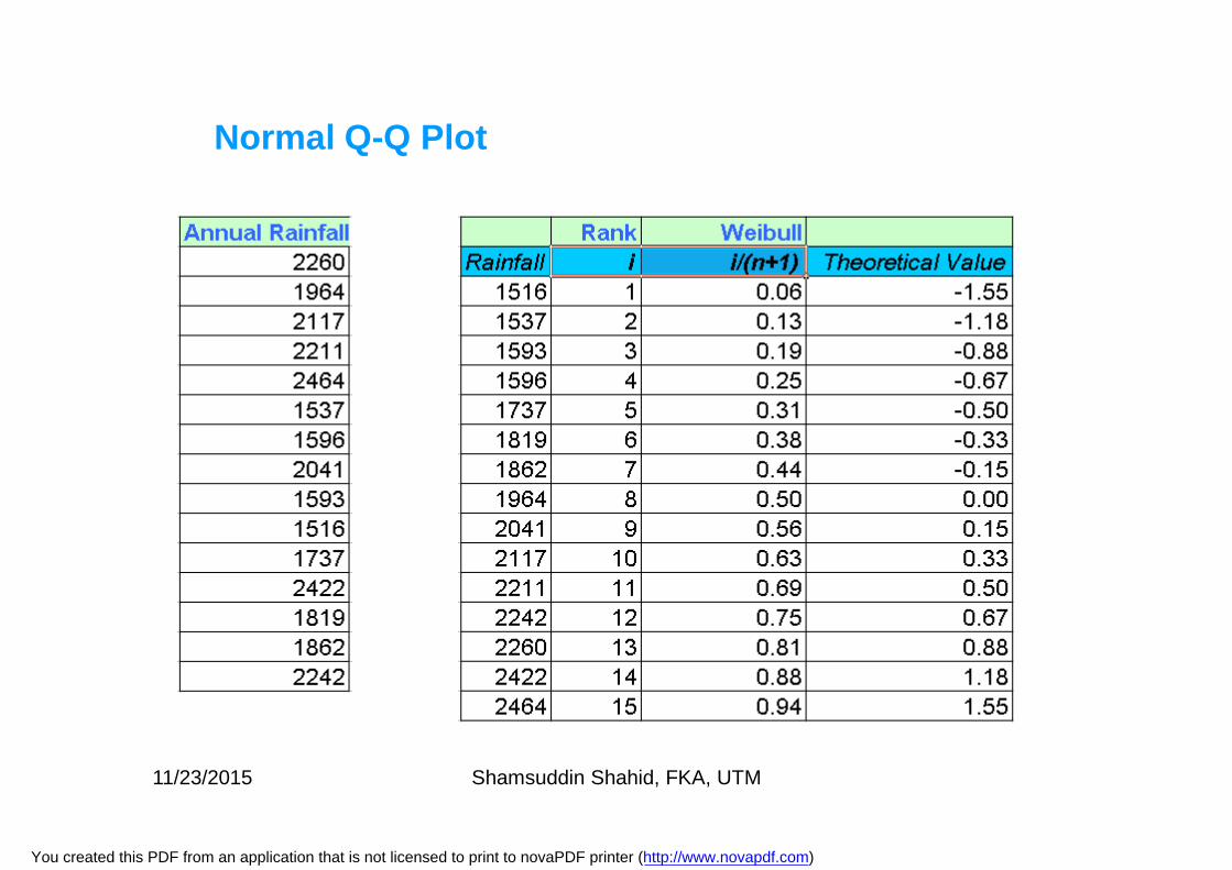
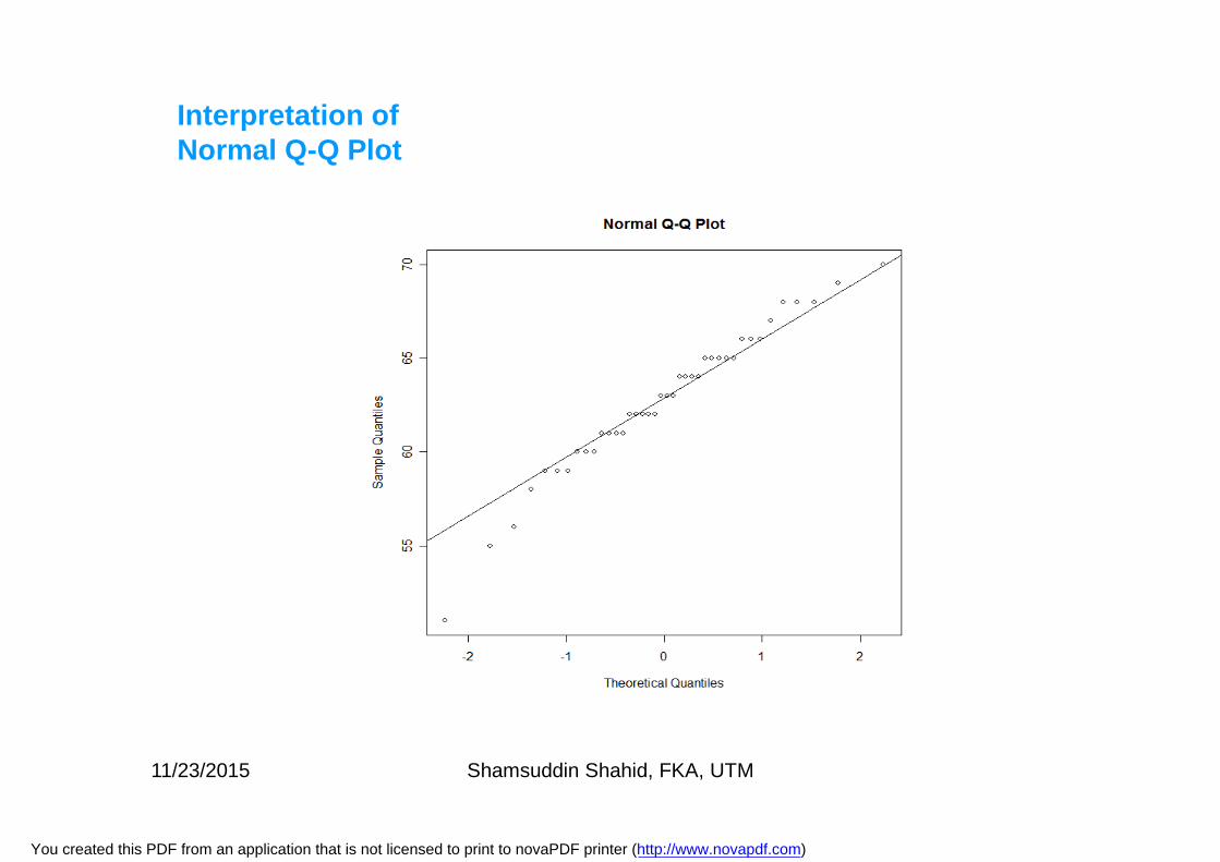
Normal Q-Q Plot
11/23/2015 Shamsuddin Shahid, FKA, UTM
You created this PDF from an application that is not licensed to print to novaPDF printer (http://www.novapdf.com)
QQ--Q PlotsQ Plots
11/23/2015 Shamsuddin Shahid, FKA, UTM
You created this PDF from an application that is not licensed to print to novaPDF printer (http://www.novapdf.com)
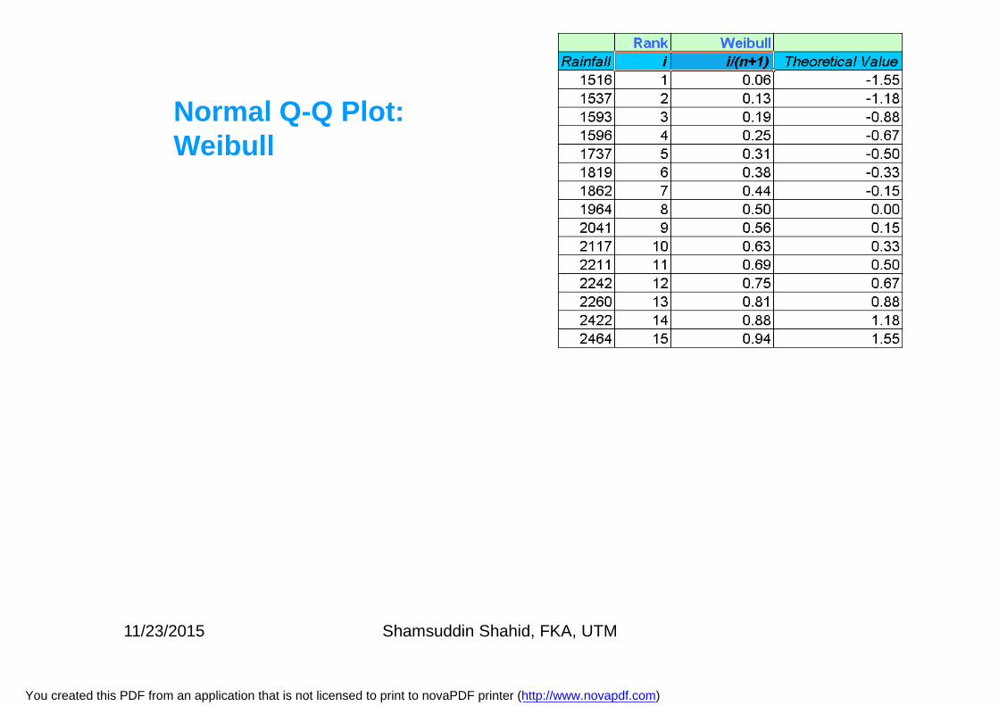
Normal Q-Q Plot: Weibull
11/23/2015 Shamsuddin Shahid, FKA, UTM
You created this PDF from an application that is not licensed to print to novaPDF printer (http://www.novapdf.com)
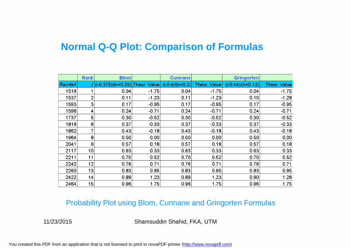
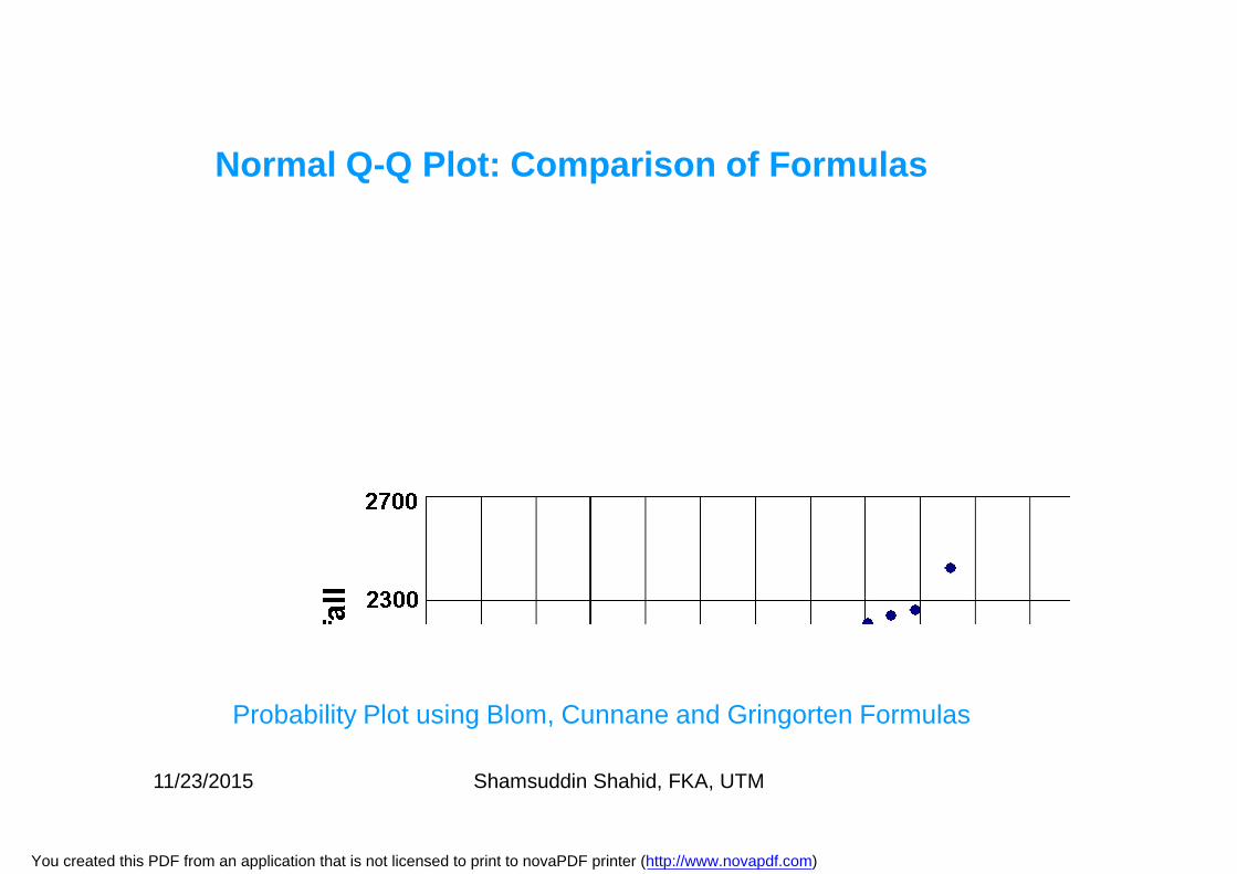
Normal Q-Q Plot: Comparison of Formulas
Probability Plot using Blom, Cunnane and Gringorten Formulas
11/23/2015 Shamsuddin Shahid, FKA, UTM
You created this PDF from an application that is not licensed to print to novaPDF printer (http://www.novapdf.com)
Normal Q-Q Plot: Comparison of Formulas
Probability Plot using Blom, Cunnane and Gringorten Formulas
11/23/2015 Shamsuddin Shahid, FKA, UTM
You created this PDF from an application that is not licensed to print to novaPDF printer (http://www.novapdf.com)
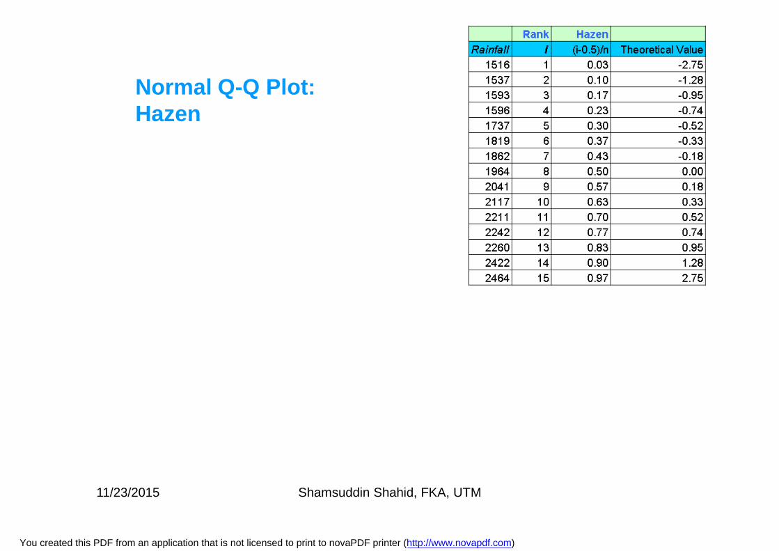
Normal Q-Q Plot: Hazen
11/23/2015 Shamsuddin Shahid, FKA, UTM
You created this PDF from an application that is not licensed to print to novaPDF printer (http://www.novapdf.com)

Q-Q Plot using:
Weibull Formula
Blom, Cunnane and Gringorten Formulas
Hazen Formula11/23/2015 Shamsuddin Shahid, FKA, UTM
You created this PDF from an application that is not licensed to print to novaPDF printer (http://www.novapdf.com)
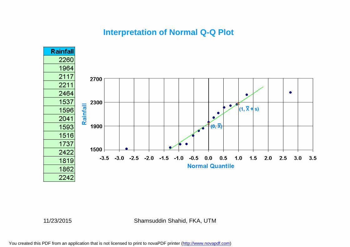
Interpretation of Normal Q-Q Plot
11/23/2015 Shamsuddin Shahid, FKA, UTM
You created this PDF from an application that is not licensed to print to novaPDF printer (http://www.novapdf.com)
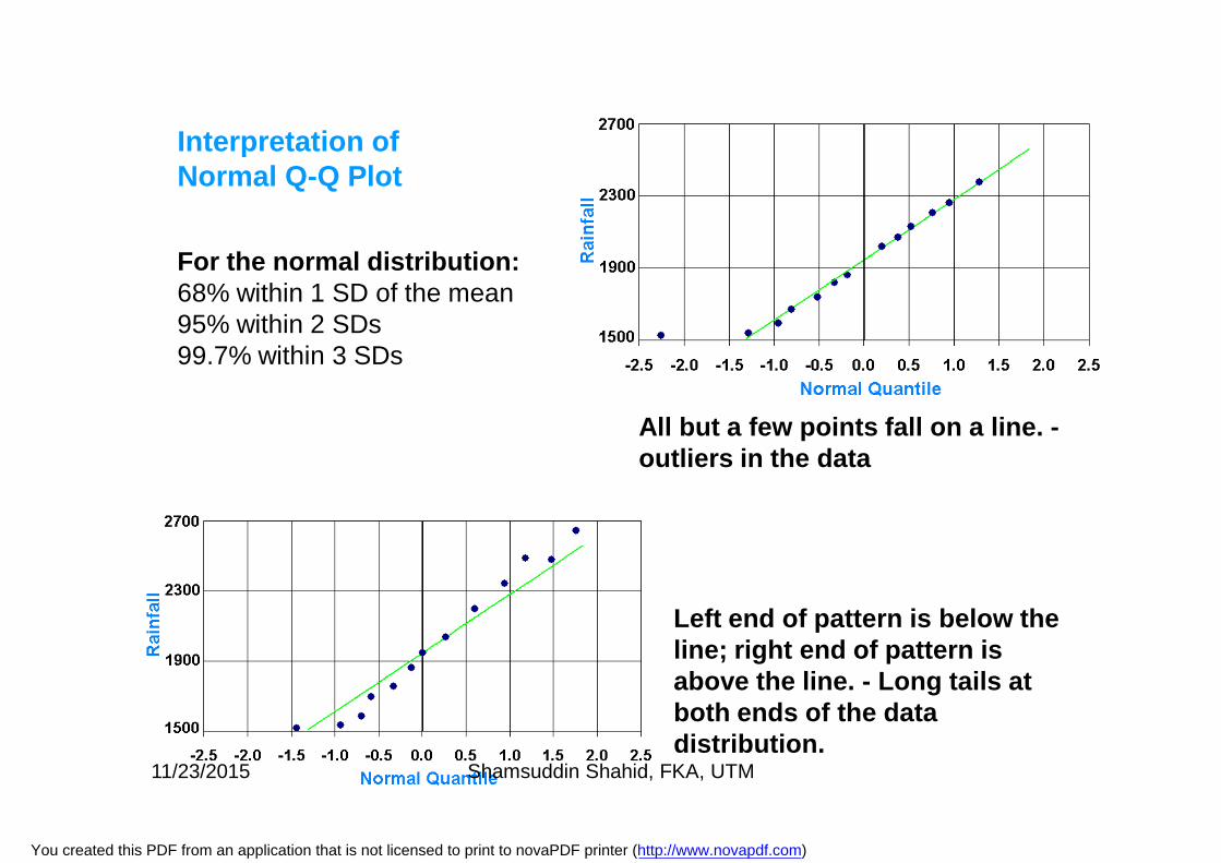
All but a few points fall on a line. -outliers in the data
Left end of pattern is below the line; right end of pattern is above the line. - Long tails at both ends of the data distribution.
Interpretation of Normal Q-Q Plot
For the normal distribution:68% within 1 SD of the mean95% within 2 SDs99.7% within 3 SDs
11/23/2015 Shamsuddin Shahid, FKA, UTM
You created this PDF from an application that is not licensed to print to novaPDF printer (http://www.novapdf.com)
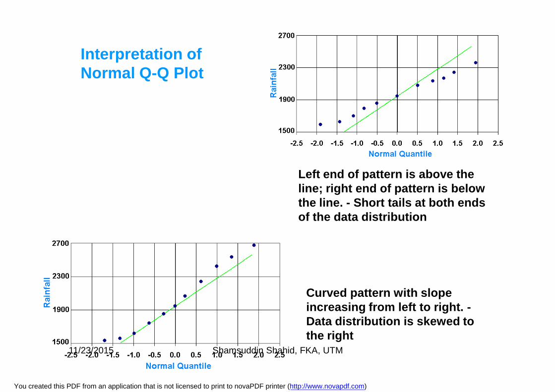
Left end of pattern is above the line; right end of pattern is below the line. - Short tails at both ends of the data distribution
Curved pattern with slope increasing from left to right. -Data distribution is skewed to the right
Interpretation of Normal Q-Q Plot
11/23/2015 Shamsuddin Shahid, FKA, UTM
You created this PDF from an application that is not licensed to print to novaPDF printer (http://www.novapdf.com)
Interpretation of Normal Q-Q Plot
11/23/2015 Shamsuddin Shahid, FKA, UTM
You created this PDF from an application that is not licensed to print to novaPDF printer (http://www.novapdf.com)
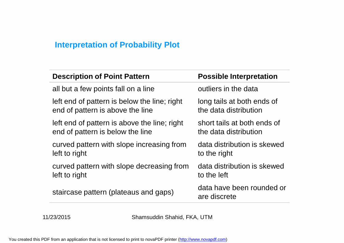
Description of Point Pattern Possible Interpretation all but a few points fall on a line outliers in the data
left end of pattern is below the line; right end of pattern is above the line
long tails at both ends of the data distribution
left end of pattern is above the line; right end of pattern is below the line
short tails at both ends of the data distribution
curved pattern with slope increasing from left to right
data distribution is skewed to the right
curved pattern with slope decreasing from left to right
data distribution is skewed to the left
staircase pattern (plateaus and gaps) data have been rounded or are discrete
Interpretation of Probability Plot
11/23/2015 Shamsuddin Shahid, FKA, UTM
You created this PDF from an application that is not licensed to print to novaPDF printer (http://www.novapdf.com)
Q-Q Plot
Q-Q plot is similar to probability plot, except instead of comparingone quantile with theoretical normal quantile, two quantiles arecompared.
It gives us an idea about dispersion of one set of observation withother set.
It is possible to compare two sets of observation to make someimportant interpretations.
11/23/2015 Shamsuddin Shahid, FKA, UTM
You created this PDF from an application that is not licensed to print to novaPDF printer (http://www.novapdf.com)
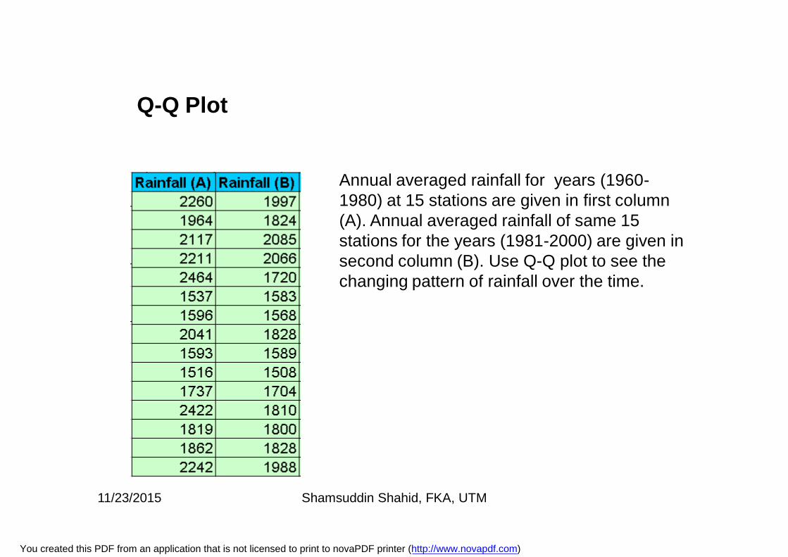
Annual averaged rainfall for years (1960-1980) at 15 stations are given in first column (A). Annual averaged rainfall of same 15 stations for the years (1981-2000) are given in second column (B). Use Q-Q plot to see the changing pattern of rainfall over the time.
Q-Q Plot
11/23/2015 Shamsuddin Shahid, FKA, UTM
You created this PDF from an application that is not licensed to print to novaPDF printer (http://www.novapdf.com)
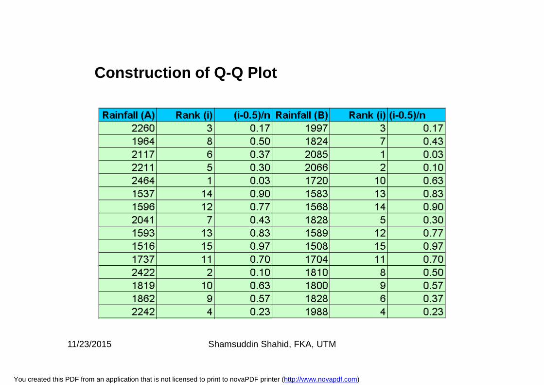
Construction of Q-Q Plot
11/23/2015 Shamsuddin Shahid, FKA, UTM
You created this PDF from an application that is not licensed to print to novaPDF printer (http://www.novapdf.com)
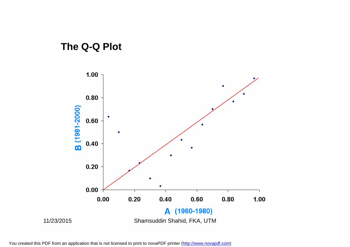
The Q-Q Plot
11/23/2015 Shamsuddin Shahid, FKA, UTM
You created this PDF from an application that is not licensed to print to novaPDF printer (http://www.novapdf.com)
• If the two distributions being compared are identical, the Q-Q plotfollows the 45° line y = x.
• If the two distributions agree after linearly transforming the valuesin one of the distributions, then the Q-Q plot follows some line, butnot necessarily the line y = x.
• If the general trend of the Q-Q plot is flatter than the line y = x, thedistribution plotted on the horizontal axis is more dispersed thanthe distribution plotted on the vertical axis.
• Conversely, if the general trend of the Q-Q plot is steeper than theline y = x, the distribution plotted on the vertical axis is moredispersed than the distribution plotted on the horizontal axis.
• Q-Q plots are often arced, or "S" shaped, indicating that one ofthe distributions is more skewed than the other, or that one of thedistributions has heavier tails than the other
The Q-Q Plot
11/23/2015 Shamsuddin Shahid, FKA, UTM
You created this PDF from an application that is not licensed to print to novaPDF printer (http://www.novapdf.com)
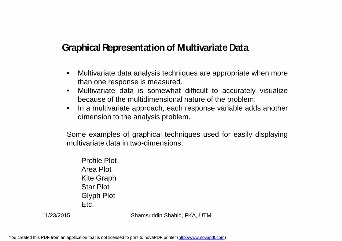
• Multivariate data analysis techniques are appropriate when morethan one response is measured.
• Multivariate data is somewhat difficult to accurately visualizebecause of the multidimensional nature of the problem.
• In a multivariate approach, each response variable adds anotherdimension to the analysis problem.
Some examples of graphical techniques used for easily displayingmultivariate data in two-dimensions:
Profile PlotArea PlotKite GraphStar PlotGlyph PlotEtc.
Graphical Representation of Multivariate Data
11/23/2015 Shamsuddin Shahid, FKA, UTM
You created this PDF from an application that is not licensed to print to novaPDF printer (http://www.novapdf.com)
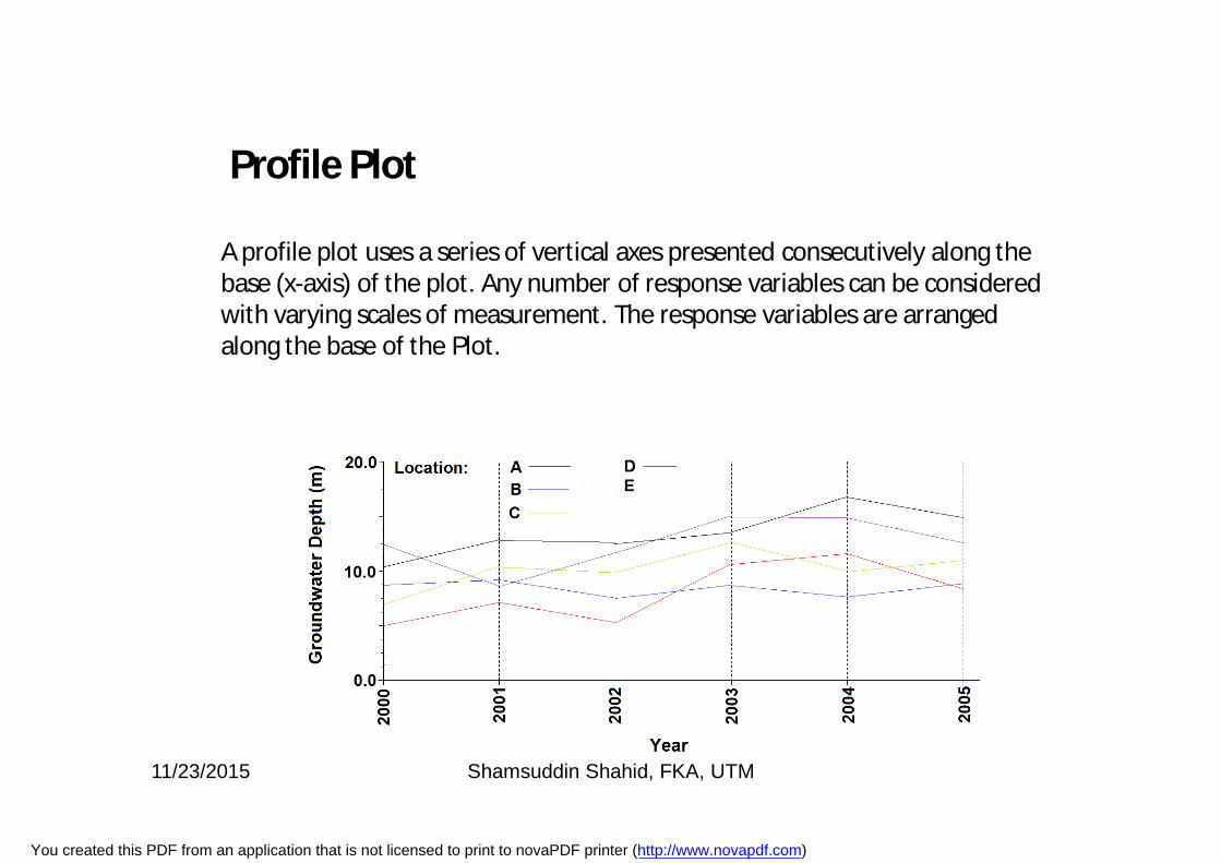
A profile plot uses a series of vertical axes presented consecutively along the base (x-axis) of the plot. Any number of response variables can be considered with varying scales of measurement. The response variables are arranged along the base of the Plot.
Profile Plot
11/23/2015 Shamsuddin Shahid, FKA, UTM
You created this PDF from an application that is not licensed to print to novaPDF printer (http://www.novapdf.com)
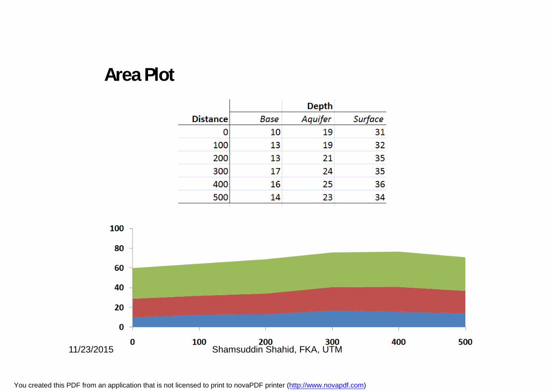
Area Plot
11/23/2015 Shamsuddin Shahid, FKA, UTM
You created this PDF from an application that is not licensed to print to novaPDF printer (http://www.novapdf.com)
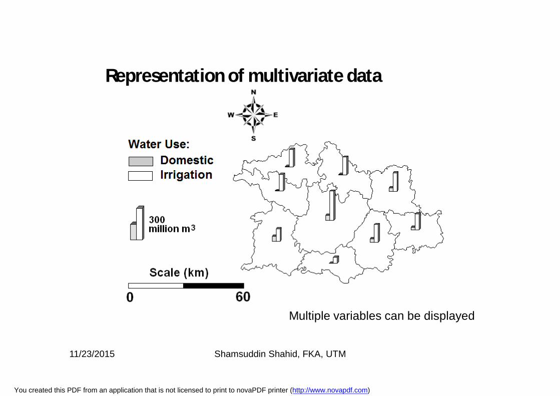
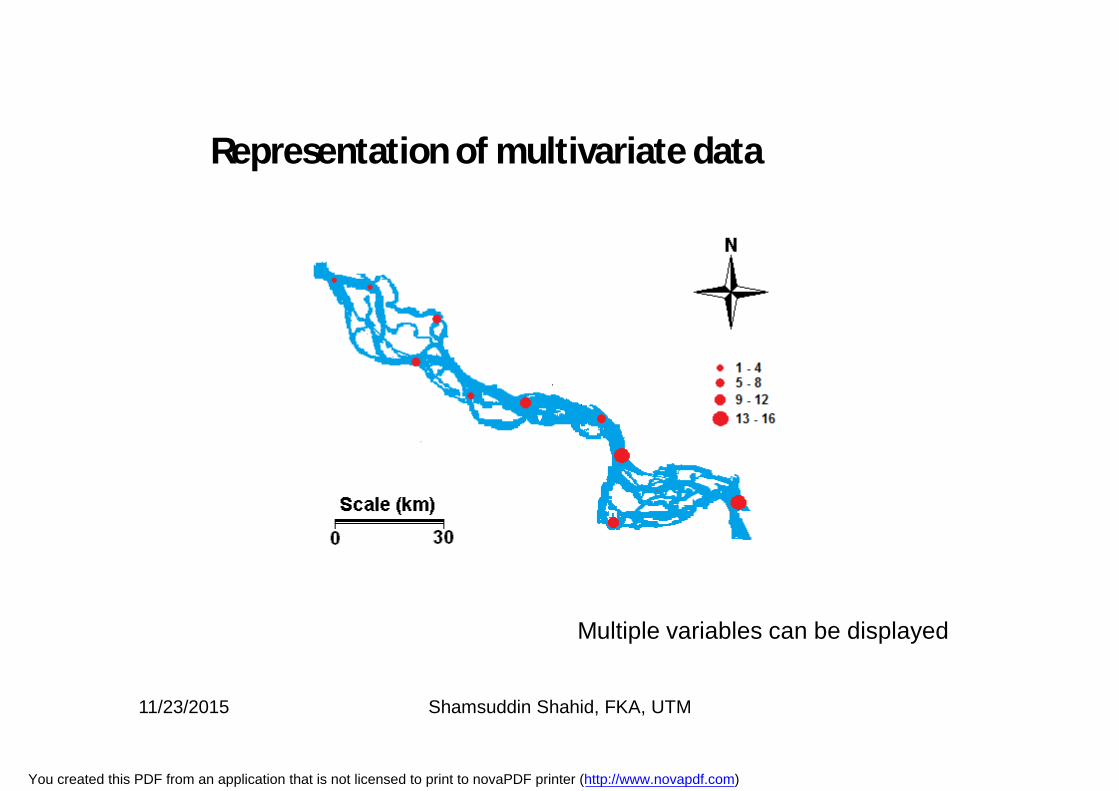
Representation of multivariate data
Multiple variables can be displayed
11/23/2015 Shamsuddin Shahid, FKA, UTM
You created this PDF from an application that is not licensed to print to novaPDF printer (http://www.novapdf.com)
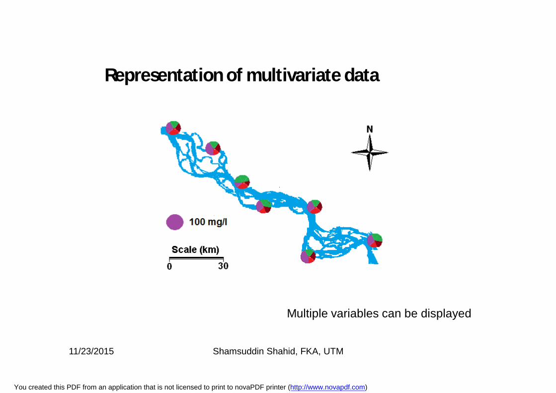
Representation of multivariate data
Multiple variables can be displayed
11/23/2015 Shamsuddin Shahid, FKA, UTM
You created this PDF from an application that is not licensed to print to novaPDF printer (http://www.novapdf.com)
Representation of multivariate data
Multiple variables can be displayed
11/23/2015 Shamsuddin Shahid, FKA, UTM
You created this PDF from an application that is not licensed to print to novaPDF printer (http://www.novapdf.com)
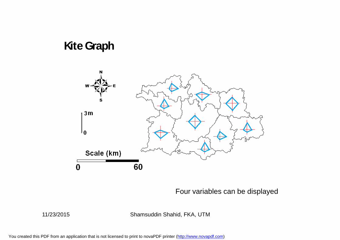
Kite Graph
Four variables can be displayed
11/23/2015 Shamsuddin Shahid, FKA, UTM
You created this PDF from an application that is not licensed to print to novaPDF printer (http://www.novapdf.com)
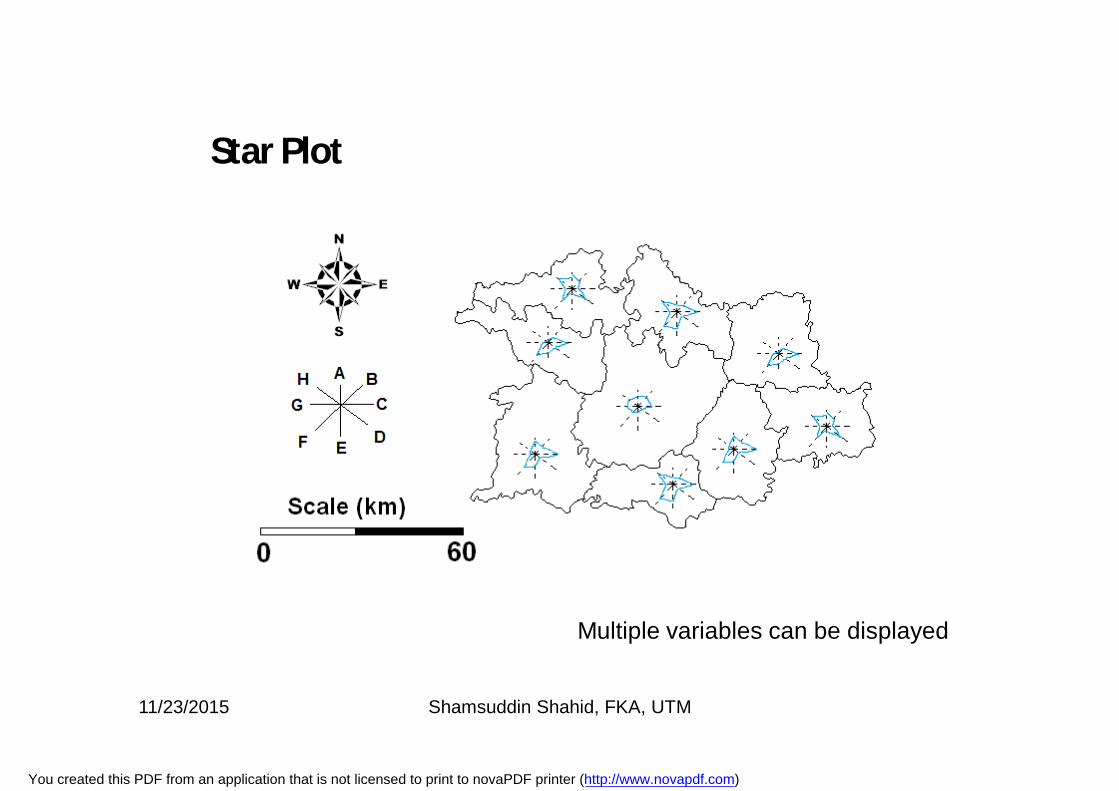
Star Plot
Multiple variables can be displayed
11/23/2015 Shamsuddin Shahid, FKA, UTM
You created this PDF from an application that is not licensed to print to novaPDF printer (http://www.novapdf.com)
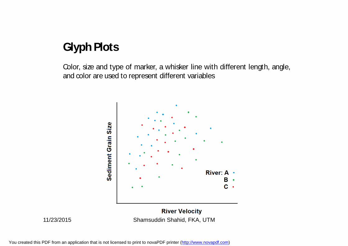
Glyph Plots
Color, size and type of marker, a whisker line with different length, angle,and color are used to represent different variables
11/23/2015 Shamsuddin Shahid, FKA, UTM
You created this PDF from an application that is not licensed to print to novaPDF printer (http://www.novapdf.com)
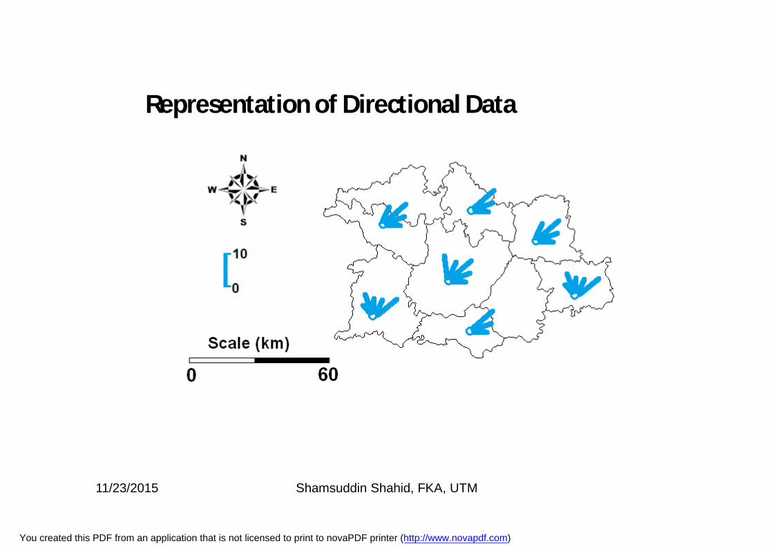
Representation of Directional Data
11/23/2015 Shamsuddin Shahid, FKA, UTM
You created this PDF from an application that is not licensed to print to novaPDF printer (http://www.novapdf.com)
Statistical HydrologyMAL1303/MKAG1273
Graphical Data Analysis
Dr. Shamsuddin ShahidAssociate Professor
Department of Hydraulics and HydrologyFaculty of Civil Engineering
Room No.: M46-332; Phone: 07-5531624; Mobile: 0182051586
Email: [email protected]
11/23/2015 Shamsuddin Shahid, FKA, UTM
You created this PDF from an application that is not licensed to print to novaPDF printer (http://www.novapdf.com)